p Chart
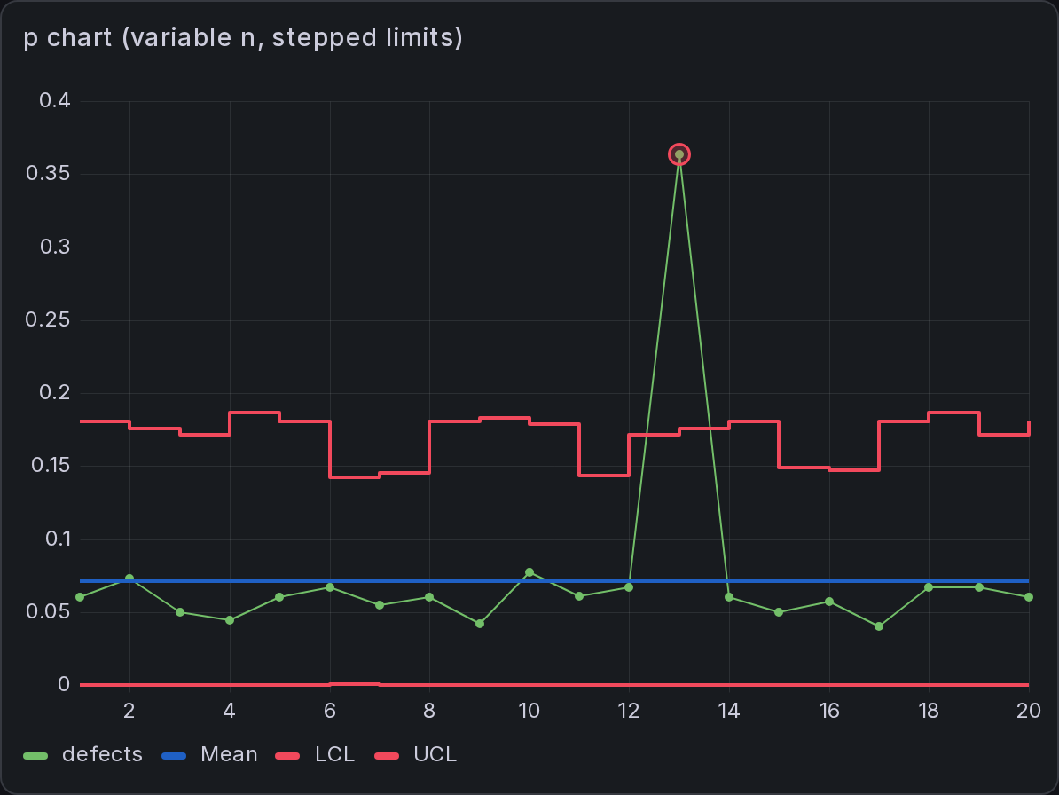
The p chart is an attribute chart in SPC Chart PRO that monitors the proportion of defective units in each subgroup. The number of units inspected may vary between subgroups.
Where a variables chart (XmR, Xbar-R) tracks a measured value, a p chart tracks a pass/fail outcome: of the units inspected in a subgroup, what fraction failed? Because the sample size can change — you might inspect 80 units one shift and 120 the next — the p chart scales the control limits to each subgroup, so a subgroup of 120 is judged against tighter limits than a subgroup of 80.
Select p chart (proportion defective) in the Chart Type dropdown.
How It Works
Each row of your query is one subgroup. The value field holds the count of defective units in that subgroup, and a second column (or a fixed option) gives the number of units inspected. The panel plots the proportion defective — defective ÷ inspected — for each subgroup.
The center line is the overall proportion defective, pooled across the subgroups included in estimation. The control limits are set at three standard deviations from the center line under the binomial distribution, and because the binomial standard error shrinks as the sample grows, the limits step in and out to follow each subgroup's own sample size.
Enable Nelson run rules to flag patterns in the proportions.
Setting It Up
The defective count must not exceed the number of units inspected.
In the SPC section, with the p chart type selected:
| Option | Description |
|---|---|
| Sample size field | A numeric field in your query giving the number of units inspected per subgroup. It is hidden from the plot automatically. |
| Fixed sample size | A constant number inspected per subgroup, used when no sample-size field is selected. |
Rows with a missing or negative count, or a missing or non-positive sample size, are treated as gaps: they are not plotted and do not contribute to the center line or the limits.
Variable Control Limits
When the sample size varies, the limits vary with it — larger subgroups give tighter limits — and the panel draws them as stepped lines that follow each subgroup's own limit.
The scalar LCL/UCL shown in labels, the statistics table, and the fill region are representative values computed from the average sample size. Run rules derive sigma from each point's upper limit rather than these representative values.
Methods and Formulas
Let each subgroup i contribute dᵢ defective units out of nᵢ inspected.
| Quantity | Formula |
|---|---|
| Plotted value | pᵢ = dᵢ ⁄ nᵢ |
| Center line | p̄ = Σdᵢ ⁄ Σnᵢ |
| Control limits | p̄ ± 3·√( p̄(1−p̄) ⁄ nᵢ ) |
The limits are clamped to the valid range [0, 1]: a lower limit that would fall below zero is held at 0, and an upper limit above 1 at 1.
Classic p limits use binomial assumptions. If the observed variation exceeds the binomial prediction (overdispersion), the limits may be too narrow, especially with large subgroups. Consider a Laney p′ chart when overdispersion explains the excess variation.
Choosing the p Chart
| Scenario | Chart |
|---|---|
| Pass/fail inspection, sample size varies | p |
| Pass/fail inspection, constant sample size | np |
| p chart with large subgroups and limits that look too tight | Laney p′ |
The sample-size configuration and chart type are saved with the dashboard. Like every chart type, the p chart works with both a time and a numeric X-axis.
The p chart is part of SPC Chart PRO. See requirements, licensing, and support.