SPC Chart PRO


SPC Chart PRO provides statistical process control (SPC) tools for monitoring process stability in Grafana. It extends SPC Chart with automatic Nelson run rule detection, attribute charts, point exclusion, staged control limits, configurable control limit estimation, and predefined parameters supplied from outside the chart.
For more specialized workflows, it includes CUSUM and EWMA charts for detecting small, sustained shifts, I-MR-R/S charts for variation between and within subgroups, and DNOM and Z-MR charts for short production runs.
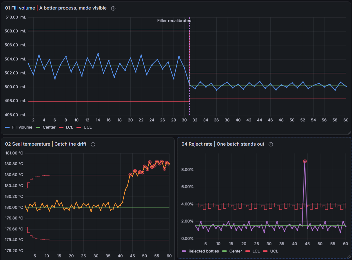
Table of Contents
- Built on SPC Chart
- Features
- Requirements
- Getting Started
- Nelson Run Rules
- Attribute Charts
- Per-chart pages: p · np · c · u · Laney p′ · Laney u′
- Chart Types
- Sample Size
- Variable Control Limits
- Control Limit Formulas
- Choosing the Right Chart
- Control Limit Estimation
- Point Exclusion
- Staged Control Limits
- CUSUM Chart
- EWMA Chart
- I-MR-R/S Chart
- DNOM Chart
- Z-MR Chart
- Predefined Parameters
- Notes and Assumptions
- Part of the KensoBI SPC Suite
- Getting Help
- License
Built on SPC Chart
SPC Chart PRO is a superset of the free SPC Chart panel. Chart types, control lines, the statistics table, CSV export, annotations, and graph styling all work exactly as documented there. This page covers only what PRO adds.
If you are new to control charts, start with the SPC Chart documentation.
Features
| Feature | Description |
|---|---|
| Nelson run rules 1–8 | Automatic detection of patterns that may indicate special-cause variation |
| Violation markers | Rings around flagged points, colored by severity |
| Attribute charts | p, np, c, u, and Laney p′/u′ charts for count-based data |
| Variable control limits | Stepped limits that follow the subgroup sample size |
| CUSUM chart | Cumulative-sum chart with upper and lower sums for catching small, sustained shifts early |
| EWMA chart | Exponentially weighted moving average for catching small, sustained shifts early |
| I-MR-R/S chart | Between/within control charts for subgrouped data with batch-to-batch variation |
| DNOM chart | Short-run chart that plots many parts on one chart as deviations from nominal |
| Z-MR chart | Short-run chart that standardizes measurements using a selectable sigma estimation method |
| Point exclusion | Omit individual points from calculations while keeping them on the chart |
| Staged control limits | Split the chart at process changes and recompute limits per stage |
| Sigma estimation methods | Rbar, Sbar, pooled standard deviation, average and median moving range |
| Historical parameters | Enter a known process mean µ and standard deviation σ instead of estimating them |
| Predefined parameters | Take the center line, σ, control limits, and specification limits for each series from typed values or a lookup query |
| Rule violation tooltips | Hovering a flagged point lists every rule it violated |
| Violation CSV export | A Run Rule Violations section in the panel's CSV export |
Requirements
- Grafana 11.6.10 or later
- A valid SPC Chart PRO commercial license
Getting Started
- Install SPC Chart PRO from the Grafana plugin catalog and add a panel using it as the visualization type.
- Configure a data source query and select a Chart Type in the SPC section. Follow the selected chart's setup instructions for sample sizes, subgroups, or part fields.
- Open the Run rules section of the panel editor and enable the rules you want to monitor.
- Optionally open Control limits to choose how the limits are estimated, to enter a known process mean and σ, or to supply predefined parameters.
Select a Chart Type other than None to access PRO charting features. The available options depend on the chart type; run rules also require usable control limits.
Nelson Run Rules
The Nelson rules test for patterns that may indicate special-cause variation. They examine point sequences, their position relative to the center line, and their distance in sigma (σ) units. A violation is a signal to investigate the process; it does not identify the cause.
Rule Reference
| # | Rule | Possible interpretation | Severity | Default |
|---|---|---|---|---|
| 1 | One point beyond 3σ from the center line | An unusually large deviation | Critical | On |
| 2 | Nine points in a row on the same side of the center line | A sustained shift | Warning | On |
| 3 | Six points in a row steadily increasing or decreasing | A trend | Warning | Off |
| 4 | Fourteen points in a row alternating up and down | Systematic oscillation | Info | Off |
| 5 | Two of three points in a row beyond 2σ, same side | An early sign of a shift | Warning | Off |
| 6 | Four of five points in a row beyond 1σ, same side | A smaller sustained shift | Warning | Off |
| 7 | Fifteen points in a row within 1σ of the center line | Unusually low variation | Info | Off |
| 8 | Eight points in a row beyond 1σ from the center line (either side) | A mixture of populations or a sustained shift | Info | Off |
The panel flags the point that satisfies a rule, and subsequent points while the pattern continues. For rules 5 and 6, the flagged point must itself be beyond the relevant sigma boundary. Rule 8 accepts points on either side of the center line; it does not require points on both sides. Missing values break a run.
Rules are evaluated independently for each control-charted series. The panel derives sigma from the upper control limit (UCL) and center line: σ = (UCL − Mean) / 3. Zone-based rules use this distance on both sides of the center line. If the displayed limits are asymmetric or clamped, this is not a direct comparison with the displayed lower control limit (LCL). With predefined parameters, the rules use the supplied σ instead, and Rule 1 can be set to test either the supplied control limits or center ± 3σ.
On charts with variable control limits (attribute charts), sigma is derived separately for each point. See Point Exclusion and Staged Control Limits for how exclusions and stage boundaries interrupt runs.
Some chart types restrict which rules apply. CUSUM and EWMA expose only Rule 1; see their pages for details.
Panel Options
In the Run rules section of the panel editor, use the Rule 1–Rule 8 switches to enable individual rules. Their definitions, severities, and defaults are listed in the Rule Reference above. The remaining options control how violations appear:
| Option | Description | Default |
|---|---|---|
| Violation markers | Highlight points that violate an enabled rule. | On |
| Critical color | Marker color for critical violations. | Red |
| Warning color | Marker color for warning violations. | Orange |
| Info color | Marker color for informational violations. | Blue |
Colors use Grafana's standard named-color palette and adapt to light and dark mode.
Violation Markers
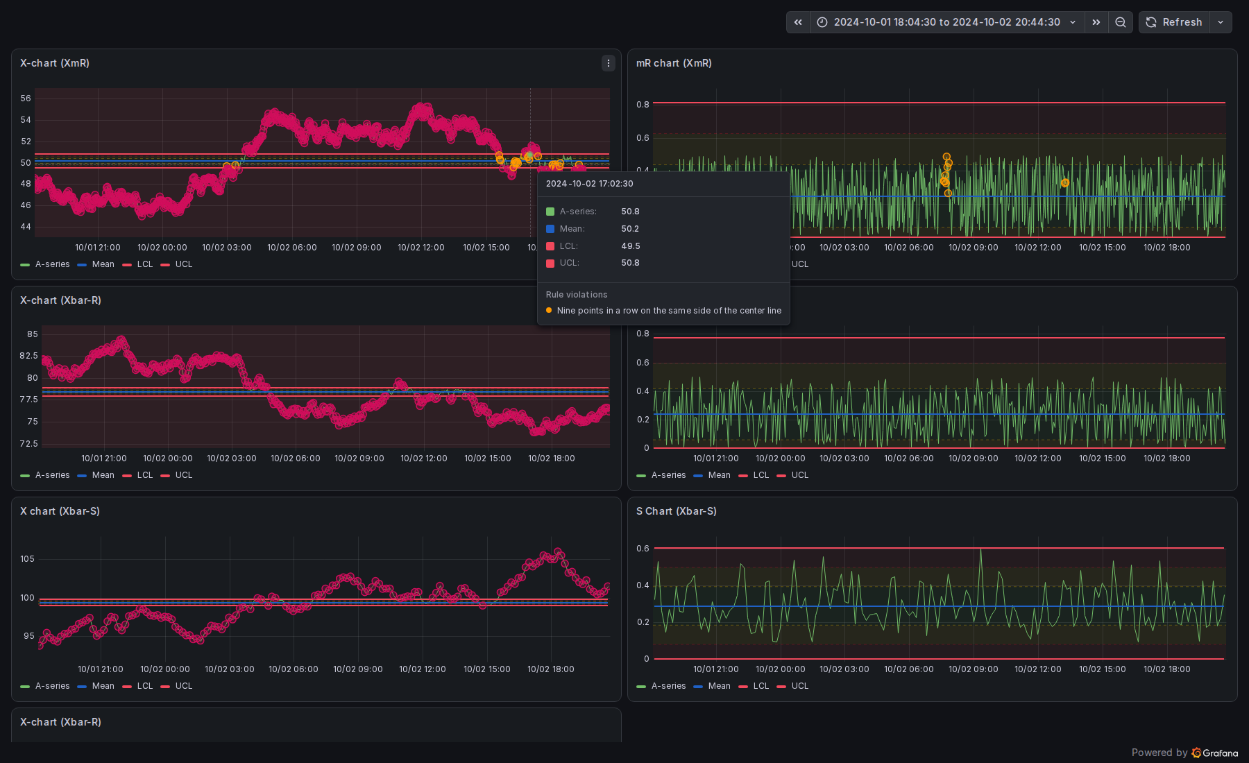
Points that violate an enabled rule are ringed in the severity color. The ring matches Grafana's point rendering and hover highlight, so a flagged point stays readable while you inspect it. When a point trips several rules at once, the ring uses the color of the most severe rule.
The ±1σ and ±2σ zone boundaries the rules test against are available as regular control lines in the Add control line dropdown, with the full color, width, and fill editor — see Sigma Zone Lines in the base panel documentation. ±3σ lines are available too, for when the control limits are supplied separately from σ.
Tooltip
Hovering a flagged point appends a Rule violations section to the tooltip, listing every rule the point violated with its severity color — not just the rule used for the marker.
Violations in the CSV Export
When enabled rules produce violations, the panel's CSV export gains a Run Rule Violations section with one row per violation:
| Column | Description |
|---|---|
| Series | The series name |
| Rule | The rule ID (e.g. nelson-1) |
| Description | The rule description |
| Point Index | Zero-based index of the flagged point within the series |
| X | The point's X-axis value |
| Value | The flagged point's value |
| Severity | critical, warning, or info |
The export is triggered the same way as in the base panel: the statistics table's download icon or the panel's right-click menu.
Attribute Charts
Variables charts (XmR, Xbar-R, Xbar-S) monitor measured values. Attribute charts monitor counts: defective units, defects per unit, or defects in a fixed inspection area. SPC Chart PRO adds six attribute chart types to the standard Chart Type dropdown.
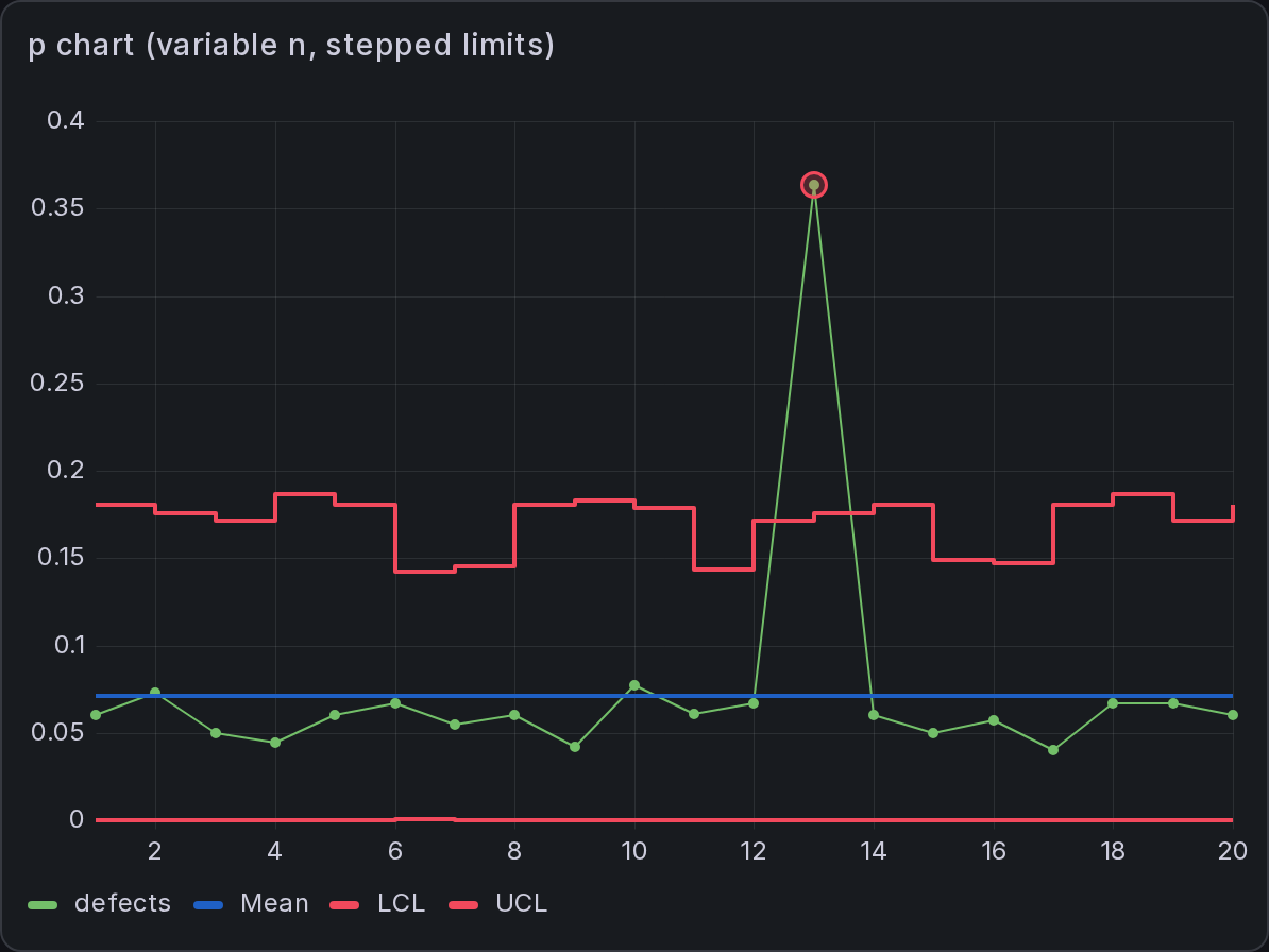
Each chart type has a dedicated page with setup instructions, formulas, and guidance on when to use it:
- p chart — proportion defective, varying sample size
- np chart — count defective, constant sample size
- c chart — defect count, fixed inspection area
- u chart — defects per unit, varying inspection area
- Laney p′ and Laney u′ — p and u charts adjusted for overdispersion or underdispersion
Chart Types
| Chart | Plots | Distribution | Sample size |
|---|---|---|---|
| p | Proportion defective per subgroup | Binomial | Required, may vary |
| np | Count defective per subgroup | Binomial | Required, should be constant |
| c | Defect count per unit | Poisson | Not used (constant inspection area) |
| u | Defects per unit | Poisson | Required, may vary |
| Laney p′ | Proportion defective | Binomial, corrected | Required, may vary |
| Laney u′ | Defects per unit | Poisson, corrected | Required, may vary |
Your query supplies the counts as the value field. Missing or negative counts are treated as gaps: they are not plotted and do not contribute to the limits. Charts that use a sample size also require it to be present and positive. For p and np charts, the defective count must not exceed the number inspected.
Sample Size
Charts that need a sample size (all except c) read it from one of two sources, configured in the SPC section:
| Option | Description |
|---|---|
| Sample size field | A numeric field holding the number inspected per subgroup, or the inspected area for u and Laney u′ charts. The field is hidden from the plot automatically. |
| Fixed sample size | A constant sample size or inspection area, used when no field is selected. |
Variable Control Limits
For p, u, and their Laney variants, larger samples give tighter limits around the proportion or rate. The panel draws variable limits as stepped lines that follow each subgroup's sample size. The np chart can also draw variable limits, but a p chart is easier to interpret when sample sizes vary.
The scalar LCL/UCL values shown in labels, the statistics table, and fill regions are representative values computed from the average sample size. Run rules derive sigma from each point's upper limit rather than these representative values.
Control Limit Formulas
| Chart | Center line | Limits |
|---|---|---|
| p | p̄ = Σ defective / Σ inspected | p̄ ± 3·√( p̄(1−p̄) / nᵢ ), clamped to [0, 1] |
| np | n̄·p̄ | nᵢ·p̄ ± 3·√( nᵢ·p̄(1−p̄) ), floored at 0 |
| c | c̄ = mean defect count | c̄ ± 3·√c̄, floored at 0 |
| u | ū = Σ defects / Σ units | ū ± 3·√( ū / nᵢ ), floored at 0 |
| Laney p′ | p̄ | p chart spread multiplied by σz, with limits clamped to [0, 1] |
| Laney u′ | ū | u chart spread multiplied by σz, with the lower limit floored at 0 |
Here, nᵢ is the subgroup's sample size, n̄ is the average sample size, and σz is the estimated short-term standard deviation of the standardized values (average moving range / 1.128). LCL and UCL denote the lower and upper control limits.
Choosing the Right Chart
| Scenario | Chart |
|---|---|
| Pass/fail inspection, sample size varies | p |
| Pass/fail inspection, constant sample size | np |
| Counting defects in a fixed inspection area | c |
| Counting defects, number of units varies | u |
| p or u chart with large subgroups and limits that look too tight | Laney p′ / u′ |
Classic p and u limits use binomial and Poisson assumptions, respectively. Overdispersion can make those limits too narrow; underdispersion can make them too wide. Laney charts adjust the spread to account for either condition. See Minitab's explanation of overdispersion and underdispersion.
Control Limit Estimation
For variables charts, the estimate of process standard deviation determines the control-limit spread. Choose a method that suits the subgroup size and the data: Rbar is commonly used for small subgroups, Sbar or pooled standard deviation for larger subgroups, and moving-range methods for individual measurements.
The free panel fixes one estimator per chart type. SPC Chart PRO makes it selectable, in a Control limits section directly below SPC in the panel editor.
Calculation is set to Automatic by default. The section displays the active estimator beneath this setting:
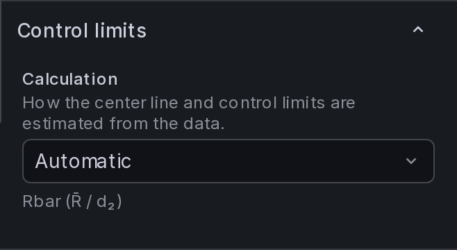
Switching Calculation to Custom… reveals the estimation settings and historical parameter inputs:
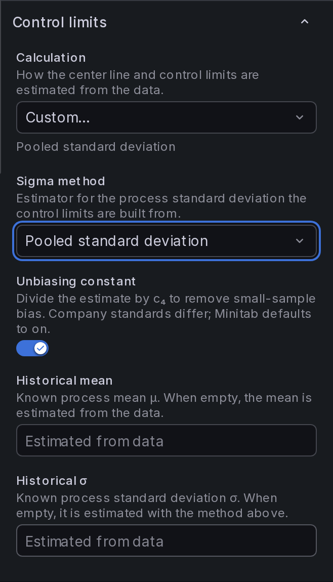
Panel Options
| Option | Description | Default |
|---|---|---|
| Calculation | Automatic uses the chart's default estimator and ignores custom settings while retaining their values. Custom… enables the settings below. Predefined parameters… replaces the estimate with supplied values — see Predefined Parameters. | Automatic |
| Sigma method | Estimator for the process standard deviation the control limits are built from. Only the methods the selected chart accepts are offered. | The chart's own estimator |
| Unbiasing constant | Divide the estimate by c₄ to remove small-sample bias. Shown only for the methods where it is optional. | On |
| Historical mean | Known process mean µ. When empty, the mean is estimated from the data. | Empty |
| Historical σ | Known process standard deviation σ. When empty, it is estimated with the method above. | Empty |
Sigma Methods
| Method | Estimate | Available on | Use when |
|---|---|---|---|
| Rbar | R̄ / d₂ | Xbar-R, Xbar-S | Subgroups of 2 to 8. The default for Xbar-R. |
| Sbar | S̄ / c₄ | Xbar-R, Xbar-S | Subgroups larger than 8. The default for Xbar-S. |
| Pooled standard deviation | √( Σ(nᵢ−1)sᵢ² / Σ(nᵢ−1) ) / c₄(d+1) | Xbar-R, Xbar-S | Combine within-subgroup variation when the subgroups share a common variance. |
| Average moving range | M̄R / d₂(2) = M̄R / 1.128 | XmR (X and mR) | The standard estimator for individuals. The default for XmR. |
| Median moving range | M̃R / d₄(2) = M̃R / 0.954 | XmR (X and mR) | A few extreme moving ranges are inflating the average and widening the limits. |
R̄ and S̄ are the average subgroup range and standard deviation; nᵢ and sᵢ are the size and standard deviation of subgroup i. The pooled degrees of freedom are d = Σ(nᵢ−1). The Sbar and pooled formulas above include the optional c₄ correction.
Only complete subgroups contribute to a subgroup estimate, since the constants assume exactly the configured subgroup size; a partial trailing subgroup is plotted but does not affect the limits. When a method cannot be computed from the available data, the chart is drawn without limits.
Changing the sigma method changes the limits, not the plotted measurements or subgroup statistics. Xbar charts still plot subgroup means, and R charts still plot subgroup ranges.
Unbiasing Constant
The switch appears only for Sbar and pooled standard deviation. Turning it off omits the c₄ correction, making the estimate smaller and the limits tighter. Choose the setting required by your organization's statistical procedure.
Rbar always divides by d₂, and the moving-range methods always divide by d₂(2) or d₄(2). These factors are built into their estimators and are not configurable.
Historical Parameters
When a process has an established baseline — an approved limit set, a validated characteristic — you can enter it directly instead of estimating it from the data in the current time range.
Historical mean (µ) sets the center line of the X chart. If Historical σ is empty, the spread is still estimated from the data.
Historical σ replaces the estimate entirely, and the chart switches to the σ-based limit formulas:
| Chart | Center line | Control limits |
|---|---|---|
| X chart (Xbar-R, Xbar-S) | µ or X̿ | Center line ± 3σ / √n |
| R chart | d₂σ | (d₂ + 3d₃)σ and (d₂ − 3d₃)σ, floored at 0 |
| S chart | c₄σ | (c₄ ± 3√(1 − c₄²))σ, floored at 0 |
| X chart (XmR) | µ or X̄ | Center line ± 3σ |
| mR chart | 1.128σ | (1.128 + 3d₃(2))σ, floored at 0 |
The R, S, and mR charts plot spread rather than location, so a historical mean does not move them — only a historical σ does.
Historical parameters are the way to keep limits stable on a dashboard with a moving time range. Estimated limits recompute as points scroll out of the window; limits built from a historical mean and σ do not move. See Exclusions and stages are anchored to the X value.
Predefined Parameters
Historical parameters set one mean and σ for the whole panel and keep the chart's own limit formulas. When the approved limits live outside Grafana, set Calculation to Predefined parameters… instead. Each measurement series then gets its own center, σ, optional LCL/UCL, and optional LSL/USL, typed in or read from a query. For example, a lookup can return the approved set for the material and machine selected in a dashboard variable.
Supplied control limits can differ from center ± 3σ. The chart draws them as given, the sigma zones follow the supplied σ, and capability uses the supplied process σ and specification limits. Predefined parameters are available on the X charts of XmR, Xbar-R, and Xbar-S. See Predefined Parameters for setup, data shapes, and validation.
Where It Applies
The Control limits section appears for the variables charts — X and mR (XmR), X and R (Xbar-R), X and S (Xbar-S). Predefined parameters… is offered only on the X charts; the mR, R, and S charts keep estimating their limits.
It is hidden for chart types whose sigma comes from the chart's own model rather than from a choice of estimator: attribute charts (binomial or Poisson), I-MR-R/S (between and within components), and the short-run DNOM chart.
Other charts keep their estimation options in the SPC section: CUSUM has Target and Historical σ inputs, EWMA has Historical mean and Historical σ, and Z-MR has a Sigma estimation option with four methods. See each chart's page for details.
Capability follows the chart. Cp and Cpk are computed from the same estimator as the control limits, so the statistics table and the chart always describe the same process sigma. Pp and Ppk are unaffected — they are based on the overall standard deviation. With predefined parameters, Cp and Cpk use the supplied process σ and the series' own predefined specification limits.
Point Exclusion
A known assignable cause — a measurement error, a startup transient — can distort the control limits for the whole chart. Point exclusion removes such a point from the calculations while keeping it visible.
To exclude a point:
- Right-click the point on the chart.
- Select Exclude from calculations.
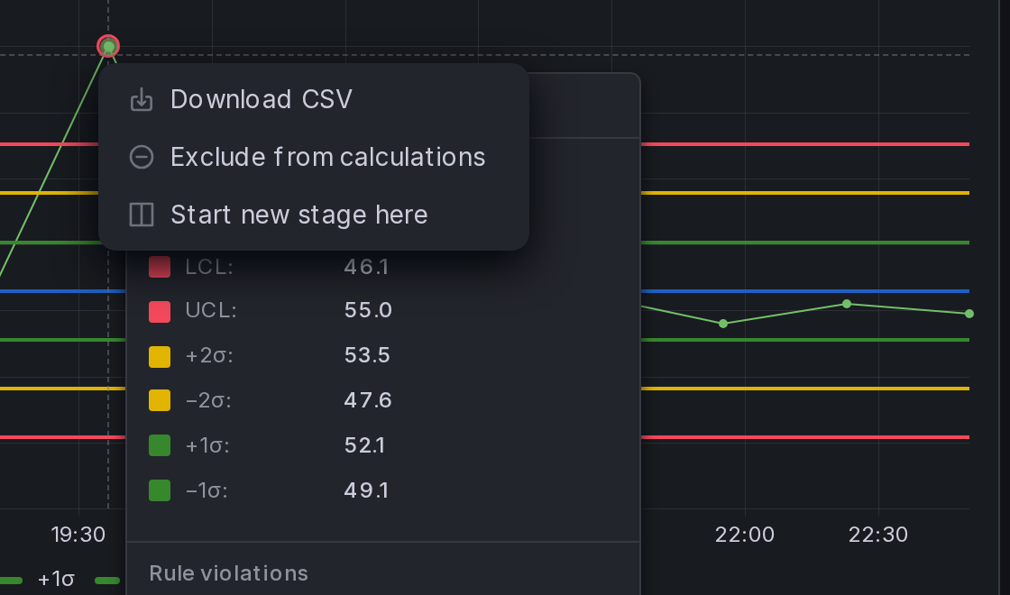
The point stays on the chart as a hollow marker and is omitted from:
- Control limits and the center line
- Run rules — an excluded point never fires a rule, and it breaks a run in progress
- The statistics table, including capability indices
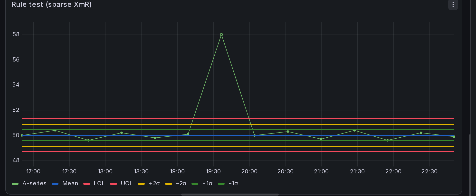
To restore a point, right-click it and select Include in calculations, or manage the full list in the Excluded points editor in the SPC section — each entry has a remove button, and Clear all restores everything. The list editor is also the way to remove an exclusion that has scrolled out of the visible time range.
On subgrouped charts (Xbar-R, Xbar-S), excluding a plotted point excludes the entire subgroup. Exclusions are saved with the dashboard.
On CUSUM and EWMA charts, excluded observations remain in the cumulative sum or moving average. See those pages for the effect on the plotted series.
Staged Control Limits
When a process deliberately changes — a new material, a machine overhaul, a recalibration — the old control limits no longer describe it. Stages split the chart at each process change and compute a separate center line and control limits for every stage, the same way Minitab handles historical stages.
To start a stage:
- Right-click the first point that belongs to the new stage.
- Select Start new stage here.
The panel draws a dashed vertical divider at the boundary with the stage label above it, and the center line, control limits, and sigma-zone lines step to each stage's own values:
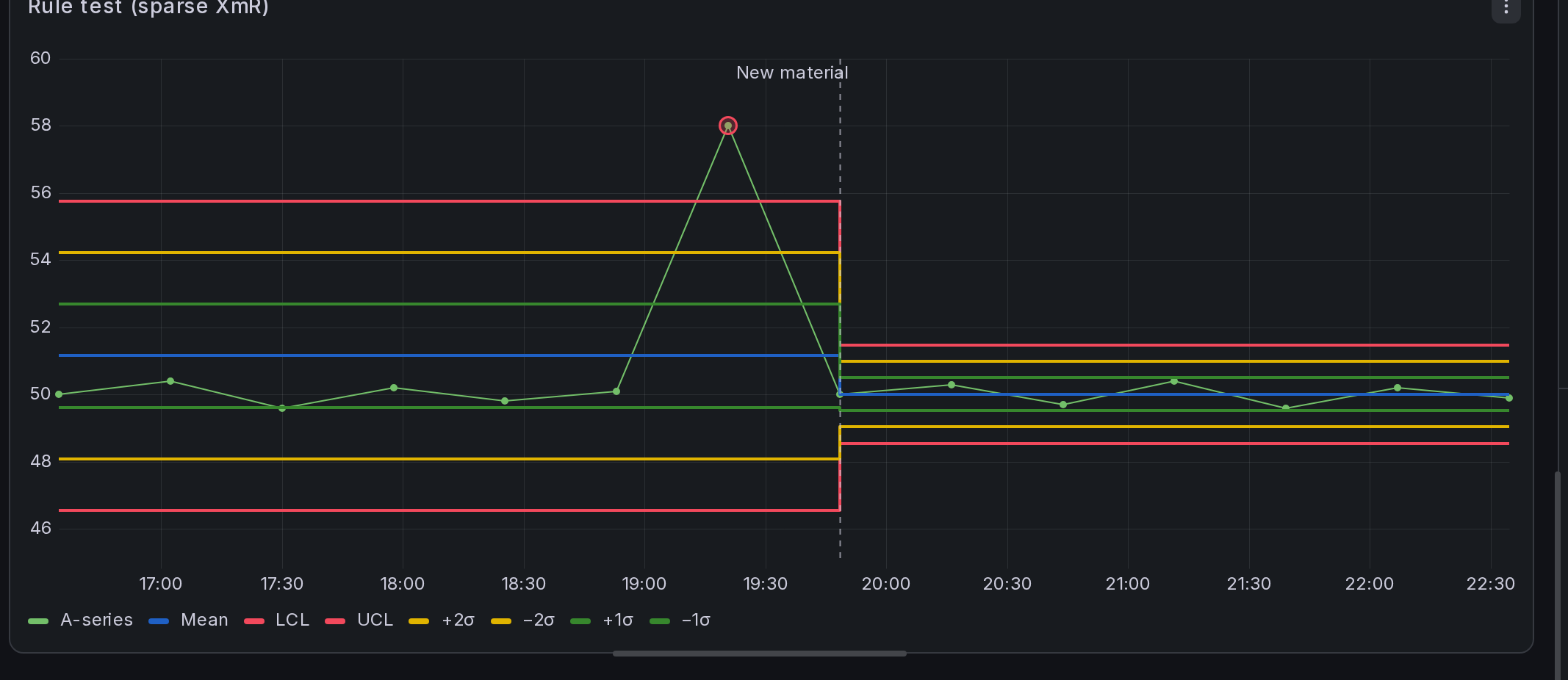
Manage stages in the Stages editor in the SPC section. Each stage has an editable label, shown above its divider, and a remove button. Clear all removes every stage boundary. To remove a boundary directly from the chart, right-click its first point and select Remove stage start.
Once at least one stage exists, a Divider style editor appears in the SPC section for styling the dashed boundary lines:
| Option | Description | Default |
|---|---|---|
| Color | Color of the divider lines (Grafana named colors supported). | Purple |
| Line style | Solid, dashed, or dotted. | Dashed |
| Line width | Thickness of the divider lines, 1–10 px. | 2 |
The style applies to every stage divider on the chart and is saved with the dashboard.
How staged values are used:
- Calculated center, control-limit, and sigma-zone lines use each stage's values. When limits are estimated from data, only that stage's data contributes.
- Run rules evaluate each stage independently and restart at every boundary.
- Labels and the statistics table's LCL/UCL columns show the most recent stage's limits — the current process.
- Point exclusion works within stages: an excluded point drops out of its own stage's calculation.
- With predefined parameters, the supplied limits stay the same across stages; run rules still restart at each boundary.
A stage needs enough points to compute limits (at least two for XmR). A stage that is too short is drawn without limits until it accumulates enough data. Stages are saved with the dashboard.
Notes and Assumptions
The following details explain how chart settings affect estimation and display.
Point exclusion is "omit from estimation"
Point exclusion leaves control limits drawn continuously through the excluded point; the limit line never breaks at one.
What "left out of the calculations" means depends on the chart:
- On variables charts (XmR, Xbar-R, Xbar-S), the point is omitted from the limit estimate.
- On attribute charts, the point is omitted from estimation but retains a displayed limit based on the remaining data and, where applicable, its own sample size.
Time-weighted charts recompute a little differently — see Point exclusion on a CUSUM chart or on an EWMA chart.
This mirrors Minitab's omit from estimation. (Minitab's other mode — excluding a point as a missing value, which leaves a gap — is not what this feature does.)
Exclusions and stages are anchored to the X value
Exclusions and stage boundaries are stored against a point's X value: a timestamp or the numeric X in numeric X-axis mode. This preserves them when the query is rerun or rows are reordered.
- On a subgrouped chart (Xbar-R, Xbar-S), the anchor is the plotted subgroup aggregate's X value.
- With a moving time range, a point that scrolls out of the visible window no longer affects the calculations — limits recompute over what is shown. For a stable, historical baseline, use a fixed time range or set historical parameters.
Estimation settings render the same in the free panel
For chart types supported by both panels, SPC Chart and SPC Chart PRO use the same estimation formulas. In the free panel, Calculation is read-only and displays the active estimator; SPC Chart PRO provides the editors for changing these settings. Panels that use the SPC Chart PRO visualization require the PRO plugin to be installed.
Automatic reproduces the classic constants exactly
For the shared variables charts, Automatic uses the tabulated Shewhart constants: A₂R̄ for Xbar-R, A₃S̄ for Xbar-S, E₂M̄R for the individuals chart, and D₃/D₄ or B₃/B₄ for the range and standard-deviation charts.
Custom estimation uses sigma-based formulas. For the same estimator, small numerical differences can arise from rounding in the tabulated constants. Selecting a different estimator can produce larger changes in the limits.
Capability is computed on the raw observations
Cp/Cpk and Pp/Ppk describe the individual measurements, not the plotted subgroup aggregates, and require specification limits (added as control lines, or supplied as predefined parameters). They are hidden for chart types where they are not meaningful.
Data shape
Attribute charts expect a flat table — one row per subgroup — with the sample-size column alongside the counts, rather than one series per category. Companion columns (sample size) are read as inputs and hidden from the plot automatically.
Part of the KensoBI SPC Suite
SPC Chart PRO is part of a growing family of Statistical Process Control plugins for Grafana by Kenso Software:
SPC Chart — The free foundation this panel is built on: XmR, Xbar-R, and Xbar-S control charts, custom control lines, capability statistics, and a statistics table.
SPC Characteristic Datasource — The datasource that powers the SPC CAD panel. Connects to your measurement database (PostgreSQL or MSSQL), lets you select features and characteristics through a point-and-click interface, and returns SPC statistics, time series measurements, and forecast data — no SQL required.
SPC CAD Panel — Brings 3D geometry into the picture, letting you bind the data from control charts and histograms to physical features on your parts.
SPC Histogram Panel — Distribution analysis with histograms, bell curves, and a built-in statistics table showing Cp, Cpk, Pp, and Ppk.
SPC Box Plot Panel — Box-and-whisker plots with built-in SPC, automatically grouping measurements into subgroups and overlaying Xf-Rf control limits.
SPC Bullet Panel — Compact bullet charts and progress bars with optional SPC metrics for dense KPI dashboards.
SPC Pareto Panel — Identify the most significant factors contributing to defects, downtime, or any categorical issue.
Getting Help
- Contact KensoBI support.
- Join the KensoBI Discord for questions and discussion.
License
This software is distributed under the Kenso Software Commercial License. Use requires a valid commercial license. See the End User License Agreement for the full terms.