SPC Chart


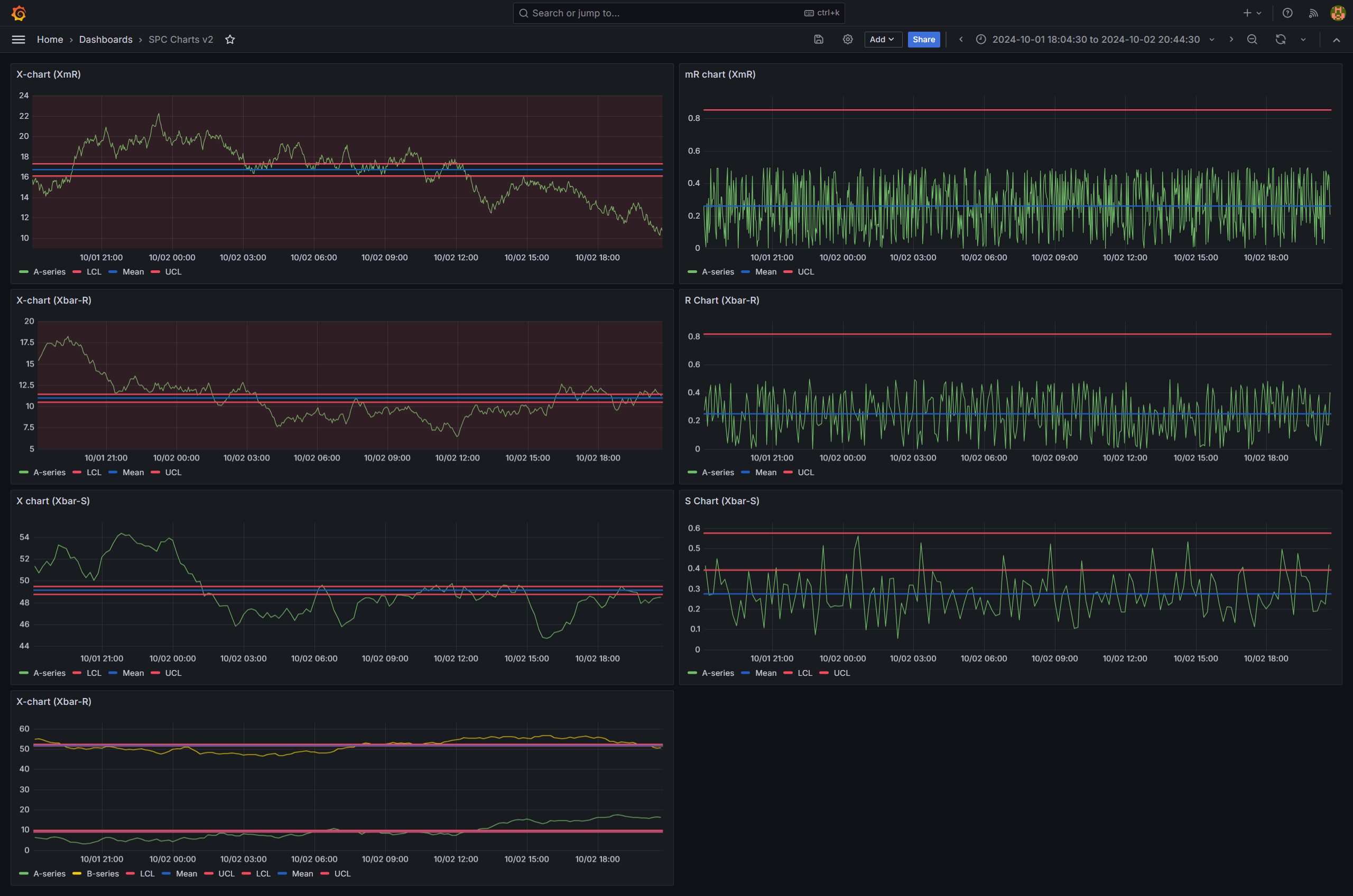
The SPC Chart panel automatically calculates and displays control limits for XmR, Xbar-R, and Xbar-S charts — so you can monitor process stability, detect special cause variation, and make data-driven decisions in real time.
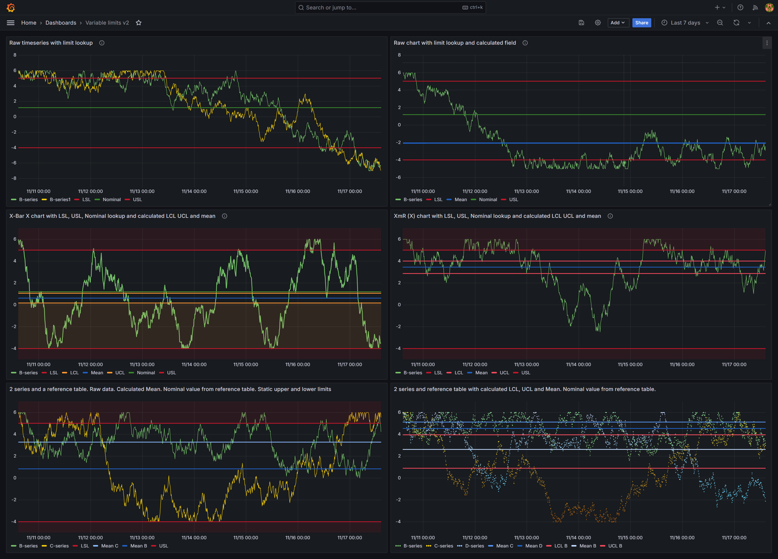
Table of Contents
- Why SPC Chart?
- Built for Grafana
- Features
- Use Cases
- Requirements
- Getting Started
- Panel Options
- Control Lines
- Chart Types
- Control Limit Formulas
- Control Limit Estimation
- Feature Queries
- Statistics Table
- Export to CSV
- Annotations
- Alerting
- Dashboard Variables
- Numeric X-axis
- Graph Styling
- Part of the KensoBI SPC Suite
- Getting Help
- License
Why SPC Chart?
Control charts are the foundation of statistical process control. They separate common cause variation (normal process behavior) from special cause variation (signals that something has changed). This plugin makes that analysis effortless:
- Automatic control limits — LCL, UCL, and Mean are calculated and displayed automatically based on the selected chart type
- Multiple chart types — XmR for individual measurements, Xbar-R for small subgroups, Xbar-S for larger subgroups
- Custom control lines — add Nominal, LSL, USL, or any custom reference line with static values or dynamic series lookup
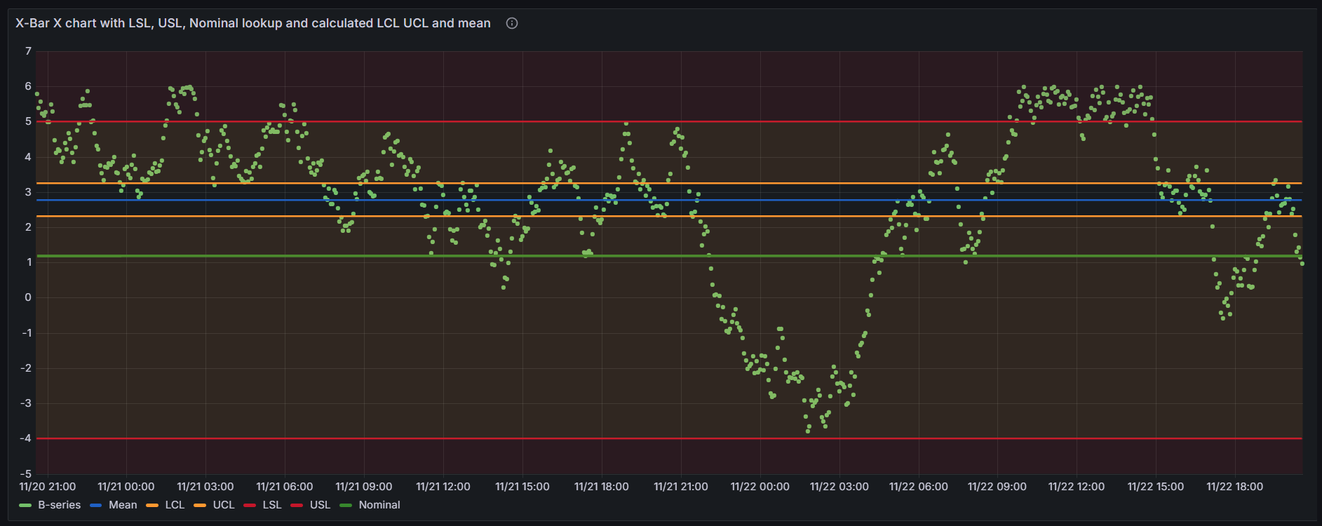
- Fill regions — visually highlight zones between control lines to show acceptable process ranges
- Statistics table — an optional table below the chart summarizing each series, including process capability (Cp, Cpk, Pp, Ppk)
Built for Grafana
SPC Chart is built using Grafana's native visualization components. This means it inherits the look, feel, and behavior you already know:
- Native theming — automatically adapts to light and dark mode
- Standard panel options — legend placement, tooltip behavior, and field overrides work just like any other Grafana panel
- Works with any data source — use it with SQL databases, Prometheus, InfluxDB, CSV files, or any other Grafana data source
Features
| Feature | Description |
|---|---|
| XmR charts | Individual (X) and Moving Range (mR) charts for single measurements |
| Xbar-R charts | Subgroup mean (X-bar) and Range (R) charts for small subgroups |
| Xbar-S charts | Subgroup mean (X-bar) and Standard Deviation (S) charts for larger subgroups |
| Automatic control limits | LCL, UCL, and Mean calculated from the data using standard SPC formulas |
| Control limit estimation | The sigma estimator behind each chart's limits, named in the panel editor |
| Custom control lines | Add Nominal, LSL, USL, or custom lines with static values or dynamic series lookup |
| Variable limits | Draw a stepped specification limit from a reference query carrying one value per point |
| Sigma zone lines | ±1σ and ±2σ zone lines derived from the control limits, with full color and fill control |
| Subgrouping | Group consecutive measurements into subgroups of size 2-25 |
| Aggregation | Aggregate raw data by moving range, range, mean, or standard deviation |
| Fill regions | Color-fill areas between control lines to highlight process zones |
| Alerting support | Grafana alerting integration with alert state annotations on the chart |
| Custom annotations | Create, edit, and delete annotations directly on the chart |
| Threshold visualization | Display alert thresholds alongside SPC control limits |
| Dashboard variables | Control subgroup size across multiple panels with a single subgroupSize variable |
| Feature queries | Mark queries as reference-only: consumed as control lines, excluded from SPC statistics |
| Statistics table | Optional summary table with per-series stats and process capability (Cp, Cpk, Pp, Ppk) |
| Export to CSV | Download the statistics and control line values as a CSV file |
| Numeric X-axis | Use a numeric field (e.g., sample index) as the X-axis instead of a time field |
Use Cases
- Manufacturing quality — monitor process parameters and detect shifts before they produce defects
- IT operations — track response times, error rates, or throughput to distinguish real incidents from normal variation
- Laboratory analysis — control measurement systems and reagent performance over time
- Supply chain — monitor delivery times, fill rates, or inventory levels for process stability
- Healthcare — track clinical metrics and patient outcomes with statistical rigor
Requirements
- Grafana 11.6.10 or later
Getting Started
- Install the SPC Chart plugin from the Grafana plugin catalog or build it from source.
- Add a new panel to your dashboard and select SPC Chart as the visualization type.
- Configure a data source query that returns time series data (a time field and one or more numeric value fields).
- Select a Chart Type from the SPC options to automatically calculate control limits, or leave it as None to use manual aggregation and custom control lines.
Requirements: Grafana 11.6.10 or later.
Panel Options
All SPC-specific options are found in the SPC section of the panel editor.
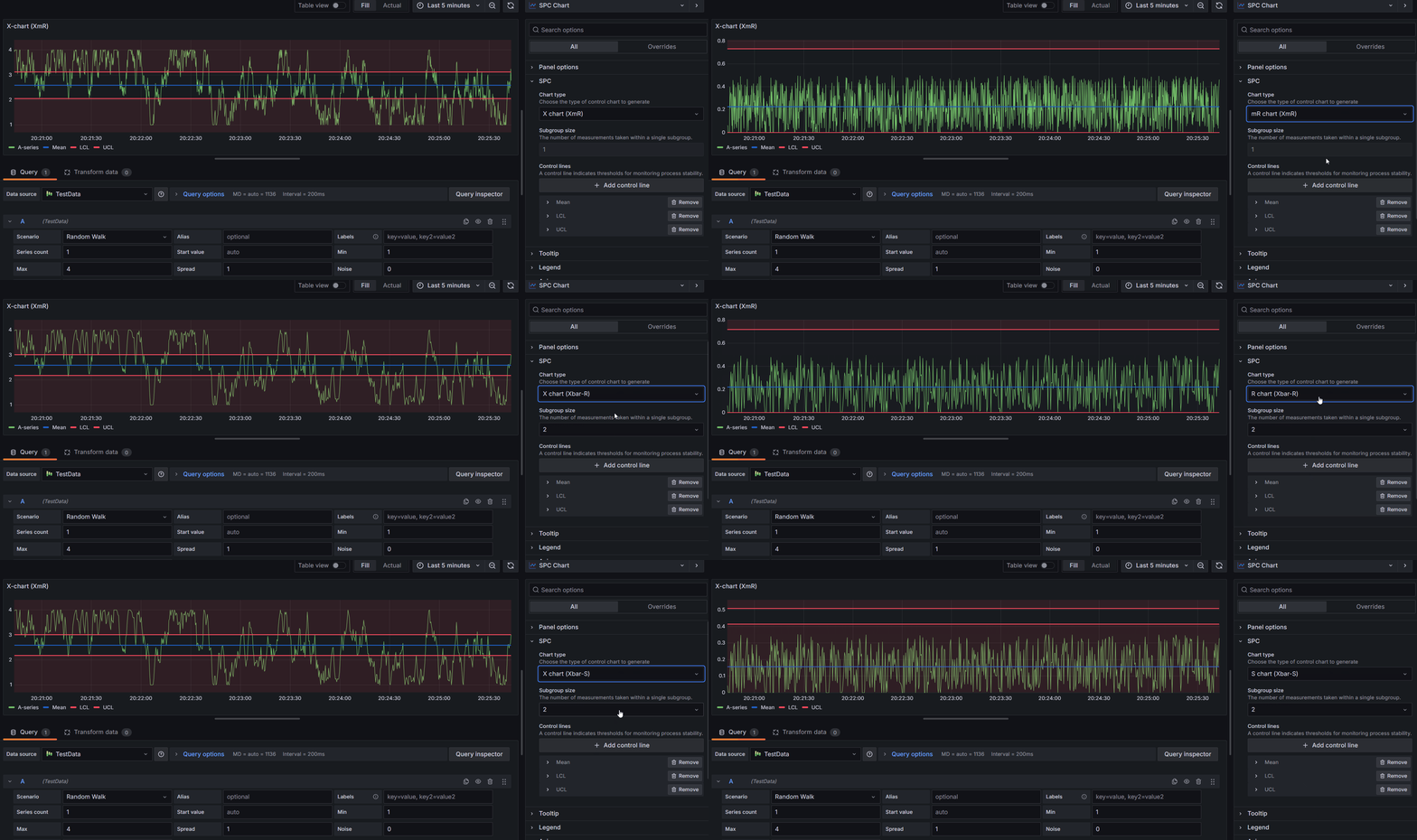
Chart Type
The chart type determines which SPC calculations are applied to your data. Available options:
| Option | Description |
|---|---|
| None | No SPC calculations. Use this for manual aggregation or to display raw data with custom control lines. |
| X (XmR) | Individual values chart from an XmR control chart. Subgroup size is fixed at 1. |
| mR (XmR) | Moving range chart from an XmR control chart. Subgroup size is fixed at 1. |
| X-bar (Xbar-R) | Subgroup means chart with range-based control limits. Requires subgroup size 2-25. |
| R (Xbar-R) | Subgroup ranges chart. Requires subgroup size 2-25. |
| X-bar (Xbar-S) | Subgroup means chart with standard deviation-based control limits. Requires subgroup size 2-25. |
| S (Xbar-S) | Subgroup standard deviations chart. Requires subgroup size 2-25. |
When you select a chart type other than None, the panel automatically adds LCL, UCL, and Mean control lines.
Subgroup Size
The subgroup size determines how consecutive data points are grouped before calculations are applied.
- XmR charts: Subgroup size is locked to 1 (individual measurements).
- Xbar-R and Xbar-S charts: Subgroup size must be between 2 and 25.
- None chart type: Subgroup size can be any value from 1 to 25.
The subgroup size can also be controlled dynamically using a dashboard variable.
Aggregation
When the Chart Type is set to None, you can select an Aggregation Type to transform the raw data before display. The available aggregation types depend on the subgroup size:
Subgroup Size = 1:
| Aggregation | Description |
|---|---|
| None | Display raw values without transformation. |
| Moving Range | Compute the absolute difference between each consecutive pair of values. |
Subgroup Size >= 2:
| Aggregation | Description |
|---|---|
| Mean | Compute the average of each subgroup. |
| Range | Compute the difference between the maximum and minimum of each subgroup. |
| Standard Deviation | Compute the sample standard deviation of each subgroup (using Bessel's correction). |
Control Lines
A control line is a horizontal reference line on the chart. Control lines can represent calculated statistical limits, manually entered values, or values pulled dynamically from a data series.
Calculated Control Lines
These control lines are computed automatically from the data:
| Line | Description | Availability |
|---|---|---|
| LCL | Lower Control Limit | Only when a chart type is selected (not None) |
| UCL | Upper Control Limit | Only when a chart type is selected (not None) |
| Mean | Average of all sample values | Always available |
| Min | Minimum sample value | Always available |
| Max | Maximum sample value | Always available |
| Range | Difference between maximum and minimum values | Always available |
| +1σ / −1σ | Sigma-zone lines one standard deviation above / below the center line | Only when a chart type is selected (not None) |
| +2σ / −2σ | Sigma-zone lines two standard deviations above / below the center line | Only when a chart type is selected (not None) |
LCL and UCL are calculated using the standard SPC formulas for the selected chart type (see Control Limit Formulas). The Mean, Min, Max, and Range lines are computed using standard descriptive statistics.
When you select a chart type, LCL, UCL, and Mean are added automatically. Each calculated line can only appear once per data series.
Sigma Zone Lines
Beyond LCL and UCL, the panel can draw the ±1σ and ±2σ zone lines — the boundaries that divide the space between the center line and the control limits into the three standard sigma zones (A, B, and C). They are added from the same Add control line dropdown as any other line (listed as +1σ, −1σ, +2σ, and −2σ) and inherit the full control-line editor: per-line color, width, fill direction, fill opacity, and per-series binding.
Their positions are derived from the series' own control limits, so they always agree with whichever chart type is selected:
- One sigma is the distance the limits imply, σ = (UCL − Mean) ⁄ 3.
- Each line is drawn at Mean ± N · σ.
By default the ±1σ lines are green and the ±2σ lines are yellow; both are fully restylable. On charts where the center line or limits vary — attribute charts with variable limits, or any chart split into stages — the sigma lines step from each point's own mean and limits, just like the LCL/UCL lines.
There is no ±3σ zone line, because ±3σ is exactly the LCL and UCL — add those lines instead. Sigma zone lines require a chart type (they are derived from control limits), so they are unavailable when the chart type is None.
These are the zones the Nelson run rules in SPC Chart PRO test against. Drawing them makes it easy to see why a point was flagged — for example rule 5 (two of three points beyond 2σ) or rule 6 (four of five beyond 1σ).
Custom Control Lines
In addition to calculated lines, you can add custom control lines with manually defined positions:
| Line Type | Description |
|---|---|
| Custom | A general-purpose custom line. |
| Nominal | The target or nominal value for the process. |
| LSL | Lower Specification Limit. |
| USL | Upper Specification Limit. |
Each custom control line supports two position modes:
- Static - Enter a fixed numeric value directly.
- Series - Pull the value dynamically from a field in one of your query results.
A Series line reads the referenced field as follows:
- A field holding a single value, or the same value repeated, draws a constant line at the field's first value. A reference query is a lookup, so the limit does not drift as new rows are appended to it.
- A field holding one value per plotted point, where the values differ, draws a variable limit: a stepped line that follows the limit as it changes.
- A field whose values vary but whose length does not match the number of plotted points cannot be aligned to them, so it falls back to the constant first value.
Variable limits
When your reference query returns a limit per part, per batch, or per time bucket — rather than one row for the whole process — the control line is drawn stepped, following the specification as it changes. This is the same rendering used for the per-point control limits of variable-sample-size attribute charts.
Nothing extra needs configuring: set Position Input to Series, point the line at the reference field, and the panel decides between a constant and a stepped line from the data it receives.
If the line has a Fill Direction set, the shaded region steps with it: the fill follows the limit rather than staying flat at its starting value.
Capability indices (Cp, Cpk, Pp, Ppk) are always computed against a single specification value. Where a variable limit is in play, its first value is used.
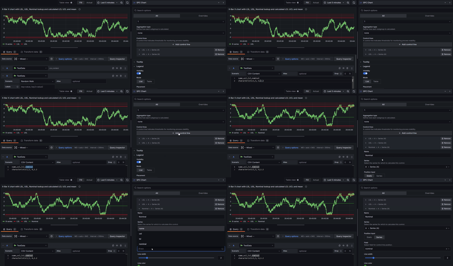
How to add a custom control line with a dynamic value from a series:
-
Set up your queries. Create at least two queries: one for the time series data and another for the reference values (e.g., specification limits).
-
Mark the reference query as a feature query. By default the SPC Chart treats every query as process data, so a reference query would be plotted as a series of its own and get a row in the statistics table. Select its refId under SPC > Feature queries and it is consumed only through the control lines that read it. See Feature Queries.
-
Add the control line. Click Add Control Line, select a custom type (e.g., USL), and choose the query containing your reference data from the Series dropdown.
-
Select the field. Set Position Input to Series, then choose the numeric field from the Position dropdown.
Older dashboards did this with a Hide in Area field override instead. That hides the reference series from the chart but leaves it in the statistics table and the CSV export. Feature queries supersedes the override.
Control Line Appearance
Each control line can be customized with the following properties:
| Property | Description |
|---|---|
| Name | Display name shown in the legend and tooltip. |
| Position | The Y-axis value where the line is drawn (for static lines). |
| Series | Which data series to associate the control line with. |
| Line Width | Line thickness, from 1 to 10 pixels. |
| Color | Line color. Calculated lines use default colors (red for LCL/UCL, blue for Min/Max, dark blue for Mean, purple for Range, green for Custom/Nominal/LSL/USL). |
| Fill Direction | Below (-1), None (0), or Above (1). Creates a shaded region extending from the line to the adjacent control line. |
| Fill Opacity | Opacity of the filled region, from 0 to 100%. |
Fill regions are useful for visually highlighting zones between control lines. For example, you can fill the area between LCL and UCL to show the acceptable process range.
Chart Types
The SPC Chart supports three families of control charts, each a pair: one chart for monitoring central tendency and one for monitoring variability. Each family has its own page with how it works, subgroup guidance, and formulas:
- XmR (I-MR) Chart — individual measurements, no rational subgroups (subgroup size fixed at 1)
- Xbar-R Chart — small subgroups (2–10 samples), variability estimated from the range
- Xbar-S Chart — larger subgroups (10+ samples), variability estimated from the standard deviation
The Control Limit Formulas for all six charts are summarized below.
Choosing the Right Chart
| Scenario | Recommended Chart | Subgroup Size |
|---|---|---|
| Individual measurements, no rational subgroups | XmR | 1 |
| Small subgroups (2-10 samples) | Xbar-R | 2-10 |
| Larger subgroups (10+ samples) | Xbar-S | 10-25 |
| Standard deviation is a better variability estimate | Xbar-S | 2-25 |
| Simple variability monitoring with small samples | Xbar-R | 2-10 |
Control Limit Formulas
The following table summarizes the control limit formulas used for each chart type. All constants (A2, A3, B3, B4, D3, D4) are standard SPC constants that vary by subgroup size and are tabulated for sizes 2 through 25.
| Chart | Center Line | UCL | LCL |
|---|---|---|---|
| X (XmR) | X̅ | X̅ + 2.66 × mR̅ | X̅ - 2.66 × mR̅ |
| mR (XmR) | mR̅ | D4 × mR̅ | D3 × mR̅ |
| X-bar (Xbar-R) | X̅̅ | X̅̅ + A2 × R̅ | X̅̅ - A2 × R̅ |
| R (Xbar-R) | R̅ | D4 × R̅ | D3 × R̅ |
| X-bar (Xbar-S) | X̅̅ | X̅̅ + A3 × S̅ | X̅̅ - A3 × S̅ |
| S (Xbar-S) | S̅ | B4 × S̅ | B3 × S̅ |
Notation:
- X̅ = mean of individual values
- X̅̅ = grand mean (mean of subgroup means)
- mR̅ = mean of moving ranges
- R̅ = mean of subgroup ranges
- S̅ = mean of subgroup standard deviations
Control Limit Estimation
Behind every set of control limits is an estimate of the process standard deviation, and each chart type uses the estimator it is named for. The Control limits section of the panel editor, directly below SPC, names the one in force:
| Chart | Estimator | Sigma estimate |
|---|---|---|
| X and mR (XmR) | Average moving range | mR̅ / d2 = mR̅ / 1.128 |
| X-bar and R (Xbar-R) | Rbar | R̅ / d2 |
| X-bar and S (Xbar-S) | Sbar | S̅ / c4 |
These are the standard pairings, and they are what the Control Limit Formulas above express through the tabulated A2, A3, B3, B4, D3, and D4 constants. The same estimate is used for the Cp and Cpk capability indices, so the statistics table always agrees with the chart.
The section is shown for the three chart types above. With Chart Type set to None there are no calculated limits, so it does not appear.
The estimator is fixed in SPC Chart. SPC Chart PRO makes it selectable — Rbar, Sbar, or the pooled standard deviation for subgrouped charts, the average or median moving range for individuals — and adds an unbiasing-constant switch and historical mean / σ inputs for charting against a known baseline.
A dashboard built with those settings renders identical control limits in this panel: the calculations live here, and PRO adds the editors that write them. You can see which estimator such a dashboard uses in the Control limits section; changing it requires PRO.
Feature Queries
A panel often mixes two kinds of query: the measurements being charted, and reference queries that only supply values to draw against — specification limits, a nominal target, limits looked up from a database. A reference query is still a real time series, so by default the SPC Chart treats it as process data: it is plotted in its own palette color with its own points, and it gets a row in the statistics table with a meaningless Mean, Std Dev and Cp/Cpk.
To configure feature queries, use the Feature queries option in the SPC section of the panel settings and select the query reference IDs that supply reference data.
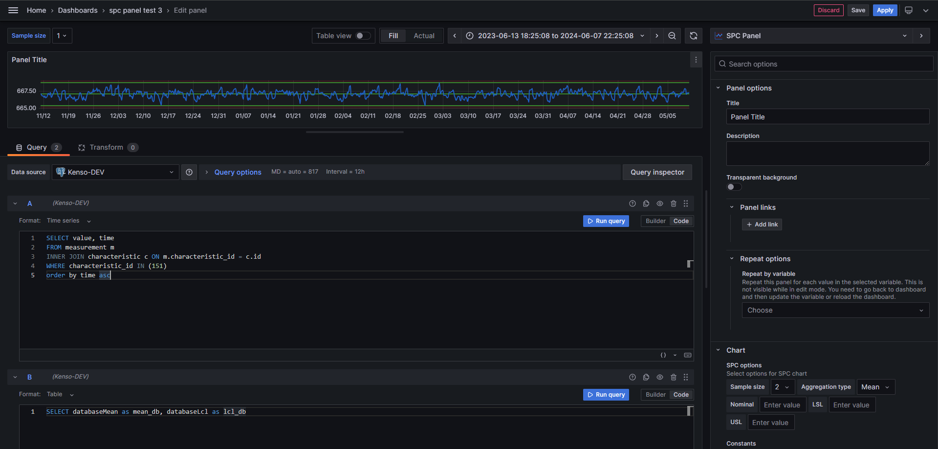
A query marked as a feature query is:
- consumed as a control line rather than plotted as a series — its values feed whichever control lines point at it, and it appears on the chart only through those lines, in the color configured on the line. This replaces the Hide in Area override previously needed to keep a reference query off the chart.
- left out of the statistics table and the CSV export.
- skipped by the SPC calculation — the chart type transform is never applied to reference values.
- left out of the series numbering that computed control lines (Mean, LCL, UCL, ±1σ, ±2σ) index into, so those lines count only your measurement queries.
See Custom Control Lines for how a reference field becomes a constant or a variable limit.
A reference query that returns no time field — a plain lookup such as name,lsl,usl,nominal — is already left out of the statistics table automatically, because only plottable frames are tabulated. Feature queries are what you need when the reference data is a time series.
Statistics Table
The SPC Chart can display a statistics table below the chart that summarizes key metrics for each data series. This gives you a quick numeric overview of your process alongside the control chart, without calculating anything by hand.
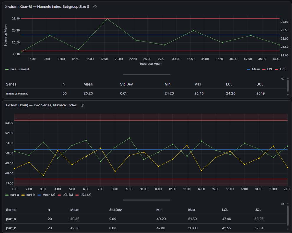
Enable it with the Show statistics table option in the panel editor. The table is off by default, so existing dashboards are unaffected until you turn it on. The chart and table share the panel space with a draggable splitter, so you can balance how much room each gets.
The descriptive statistics always describe your raw individual measurements, even when the chart plots subgroup means, ranges, or standard deviations. This means the statistics (and the capability indices) are the same whichever chart of a pair you display — for example the X-bar and R charts of an Xbar-R pair report identical numbers.
Descriptive Statistics
The table shows the following columns for each series:
| Column | Description |
|---|---|
| Series | The name of the data series |
| n | Number of measurements in the series |
| Mean | The average of all measurements |
| Std Dev | Standard deviation — how spread out the measurements are |
| Min | The smallest measurement in the series |
| Max | The largest measurement in the series |
Control Limits
When a control chart type is selected (XmR, Xbar-R, or Xbar-S), the table also shows:
| Column | Description |
|---|---|
| LCL | Lower Control Limit — the lower boundary calculated by the control chart |
| UCL | Upper Control Limit — the upper boundary calculated by the control chart |
These columns only appear when a chart type is selected (not None).
Process Capability Indices
Process capability indices tell you how well your process fits within specification limits. They answer the question: "Is my process producing results within the acceptable range?"
These columns only appear when you have defined both a Lower Specification Limit (LSL) and an Upper Specification Limit (USL) as control lines.
| Column | Description |
|---|---|
| Cp | Process capability — can the process fit within spec limits? |
| Cpk | Process capability adjusted for centering — is the process centered? |
| Pp | Process performance — similar to Cp but uses overall variation |
| Ppk | Process performance adjusted for centering — similar to Cpk using overall variation |
What are Cp and Cpk?
Cp measures whether the spread of your process is narrow enough to fit within the specification limits. It uses short-term, within-subgroup variation.
- Cp = 1.0 means the process spread exactly matches the spec width
- Cp > 1.33 is generally considered good — your process fits well within specs
- Cp < 1.0 means the process spread is wider than the spec limits
Cpk is like Cp, but also checks whether the process is centered between the spec limits. A high Cp with a low Cpk means your process is capable but shifted to one side.
What are Pp and Ppk?
Pp and Ppk are similar to Cp and Cpk, but they use the overall standard deviation instead of the within-subgroup estimate. This makes them better for evaluating long-term process performance.
- Use Cp/Cpk to understand short-term process capability
- Use Pp/Ppk to understand long-term process performance
- When Cp and Pp are similar, the process is stable over time
Setting up Specification Limits
To see capability indices in the table, add LSL and USL control lines:
- Go to Editor > SPC > Control Lines.
- Click Add Control Line and select LSL (Lower Specification Limit).
- Enter the lower specification value for your process (or pull it from a series — see Custom Control Lines).
- Add another control line and select USL (Upper Specification Limit).
- Enter the upper specification value.
Once both limits are defined, the Cp, Cpk, Pp, and Ppk columns appear in the table.
Editor Options
The statistics table is configured in the panel editor under the Statistics Table section:
| Option | Description | Default |
|---|---|---|
| Show statistics table | Toggle the entire table on or off. | Off |
| Visible columns | Choose which columns appear. Use this to simplify the table by hiding columns you don't need. Columns that don't apply (control limits with no chart type, or capability indices with no spec limits) are hidden automatically. | All columns |
Export to CSV
You can export the calculated SPC values to a CSV file. There are two ways to trigger the export:
- Download icon — Click the download icon in the top-right corner of the statistics table.
- Right-click menu — Right-click anywhere on the panel and select Download CSV.
The exported file contains two sections:
| Section | Contents |
|---|---|
| Statistics | One row per series with the same columns shown in the table (Series, n, Mean, Std Dev, Min, Max, LCL, UCL, Cp, Cpk, Pp, Ppk). Only the columns visible in the table are included. |
| Control Lines | Name, series, type, and resolved position for each configured control line. |
The exported file is named spc-statistics_YYYY-MM-DD_HHMMSS.csv.
This exports the calculated values from the SPC analysis, not the raw data from the data source. Grafana's built-in Download CSV in the panel Inspect menu exports the raw data source values instead.
Annotations
The SPC Chart supports both custom user annotations and Grafana alert annotations.
Custom Annotations
You can create annotations directly on the chart to mark events, notes, or observations at specific points in time.
To create an annotation:
- Hover over a data point on the chart and click to pin the tooltip.
- Click the Add annotation button in the pinned tooltip.
- Enter a Description (required) and optionally add Tags.
- Click Save.
To edit an annotation:
- Click on an existing annotation marker on the chart.
- Click the Edit button in the annotation tooltip.
- Modify the description or tags.
- Click Save.
To delete an annotation:
- Click on an existing annotation marker on the chart.
- Click the Remove button in the annotation tooltip.
- Confirm the deletion.
Annotations are stored in Grafana and are associated with the dashboard and panel.
Alert Annotations
When Grafana alerting is configured, alert state changes are displayed as vertical dashed lines on the chart. Each annotation is color-coded by alert status:
| Status | Color |
|---|---|
| Alerting | Red |
| OK | Green |
| Pending | Orange |
| No Data | Blue |
| Error | Red |
Hovering over an alert annotation shows details including the timestamp, alert name, labels, and status.
Alerting
The SPC Chart panel supports Grafana's built-in alerting system. You can create alert rules based on SPC control limits to automatically detect when your process goes out of statistical control.
Examples of SPC-based alert rules:
- Alert when a value exceeds the Upper Control Limit (UCL).
- Alert when a value falls below the Lower Control Limit (LCL).
- Alert on trends or patterns that indicate special cause variation.
To set up alerting:
- Configure an alert rule in Grafana that uses the same data source query as your SPC Chart.
- Set threshold conditions based on your calculated control limits.
- Alert state annotations and threshold lines will be displayed on the chart automatically.
Threshold visualization: You can configure alert thresholds in the panel's field configuration. Thresholds are rendered alongside SPC control limits on the chart. The threshold display style can be set to Off, Line, or Area in the graph styling options.
Dashboard Variables
Subgroup Size Variable
The SPC Chart has built-in support for a dashboard variable named subgroupSize. When this variable exists, it overrides the panel's subgroup size setting, allowing you to control the subgroup size for multiple SPC Chart panels from a single variable.
To use it:
- Go to Dashboard Settings > Variables.
- Create a new variable named
subgroupSize. - Set the variable type (e.g., Custom with a comma-separated list of sizes like
1,2,3,5,10). - All SPC Chart panels on the dashboard will use this variable's value for the subgroup size.
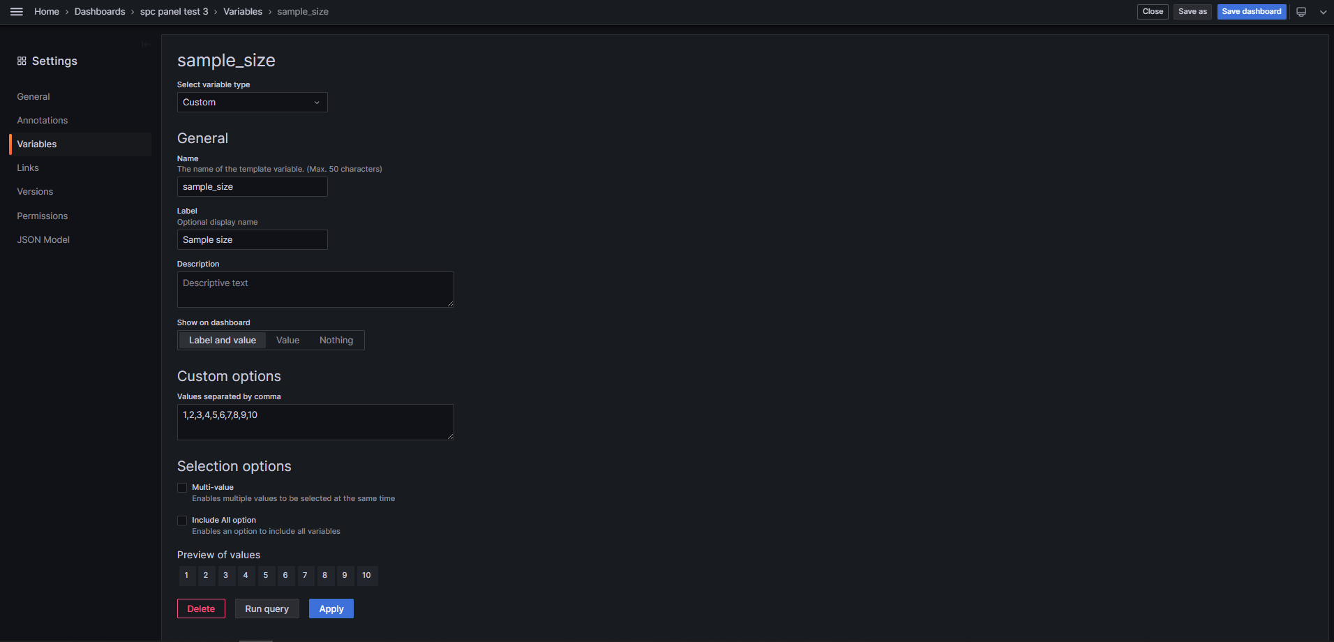
When the dashboard variable is active, the subgroup size input in the panel editor is disabled and shows the variable's current value.
The variable name is case-insensitive (subgroupSize, subgroupsize, and SUBGROUPSIZE all work).
Numeric X-axis
By default, the SPC Chart expects a time field as the X-axis. If your data does not have timestamps — for example, measurements indexed by sample number, batch number, or sequential ID — you can switch to a numeric X-axis.
This works the same way as Grafana's built-in Trend panel: any numeric field in your dataset can be used as the X-axis, as long as its values are strictly ascending.
Configuring the X-axis field
In the panel editor, open the Axis category and find the X-axis field option. The dropdown lists all numeric fields available in your query results. Select the field you want to use as the X-axis, or leave it set to Time (default) for standard time series behavior.
The field is located by name, in each query independently. Any query may supply it — it does not have to be the first one — and your queries need not return their columns in the same order. A reference query that carries no X column at all simply has none, and does not affect the setting.
| Value | Description |
|---|---|
| Time (default) | Standard time series mode. The X-axis is a time field. |
| Numeric field | The selected numeric field is used as the X-axis. Values must be ascending (e.g., 1, 2, 3, ...). |
When a numeric X-axis is selected, the Time zone option is hidden — it only applies to time-based charts.
Use cases
- Sample-indexed data — quality inspection results recorded by sample number rather than timestamp.
- Batch data — production batch numbers as the X-axis to track process behavior across batches.
- Sequential measurements — any ordered sequence where time is not meaningful (lab specimens, test runs, etc.).
Requirements
- The numeric X-axis field must contain ascending values. Non-monotonic sequences will produce incorrect plots or an empty chart.
- At least one query must carry a numeric field with the configured name. Which query, and where the column sits within it, does not matter.
- The X column is excluded from the statistics table — it is an index, not a measurement.
- All SPC chart types (XmR, Xbar-R, Xbar-S) and aggregation modes are fully supported with a numeric X-axis.
- Annotations and time-range zoom are not available in numeric X-axis mode.
Graph Styling
The SPC Chart inherits all standard Grafana time series graph styling options. These are available in the panel editor under the field configuration section.
Draw Styles
| Option | Values |
|---|---|
| Draw style | Line, Bars, Points |
| Line interpolation | Linear, Smooth, Step Before, Step After |
| Line width | 0-10 pixels |
| Line style | Solid, Dash, Dots (with configurable dash patterns) |
| Fill opacity | 0-100% |
| Gradient mode | None, Opacity, Hue, Scheme |
| Show points | Auto, Always, Never |
| Point size | 1-40 pixels |
Bar Options
| Option | Description |
|---|---|
| Bar alignment | Before, Center, After |
| Bar width factor | Width of bars relative to available space (0-1) |
Null Values
| Option | Description |
|---|---|
| Connect null values | Never, Always, or Threshold (connect gaps smaller than a time threshold) |
| Disconnect values | Never, or Threshold (insert gaps when consecutive points are farther apart than a time threshold) |
Stacking and Transform
- Stacking: None, Normal, or 100%
- Transform: None, Constant, or Negative Y
Axis
Standard Grafana axis configuration including placement, label, scale, grid lines, and soft min/max. The X-axis field option in this category also lets you switch between a time axis and a numeric X-axis.
Time Zones
You can display the chart in one or more time zones. Use the Time zones option in the Axis category to add additional time zone displays. This option is hidden when a numeric X-axis field is selected.
Legend and Tooltip
Standard Grafana legend and tooltip options are available, including display mode, placement, tooltip mode, and sort order.
Part of the KensoBI SPC Suite
SPC Chart is part of a growing family of Statistical Process Control plugins for Grafana by Kenso Software:
SPC Chart PRO — Everything in SPC Chart, plus automatic Nelson run rule detection, attribute charts (p, np, c, u, Laney), point exclusion, staged control limits, and time-weighted CUSUM/EWMA charts for catching out-of-control signals as they happen.
SPC Characteristic Datasource — The datasource that powers the SPC CAD panel. Connects to your measurement database (PostgreSQL or MSSQL), lets you select features and characteristics through a point-and-click interface, and returns SPC statistics, time series measurements, and forecast data — no SQL required.
SPC CAD Panel — Brings 3D geometry into the picture, letting you bind the data from control charts and histograms to physical features on your parts.
SPC Histogram Panel — Distribution analysis with histograms, bell curves, and a built-in statistics table showing Cp, Cpk, Pp, and Ppk. Use it to understand process capability: is your process producing results within specification limits?
SPC Box Plot Panel — Box-and-whisker plots with built-in SPC. Automatically groups measurements into subgroups, computes quartiles and outliers, and overlays Xf-Rf control limits to detect shifts in both process location and spread.
SPC Bullet Panel — Compact bullet charts and progress bars with optional SPC metrics (Cpk, Cp, Ppk, Pp, Sigma Level) for dense KPI dashboards.
SPC Pareto Panel — Identify the most significant factors contributing to defects, downtime, or any categorical issue — so you can focus improvement efforts where they matter most.
Getting Help
- Report bugs and suggest features on GitHub Issues.
- Join the KensoBI Discord for questions and discussion.
License
This software is distributed under the Apache License 2.0.