SPC Box Plot


The SPC Box Plot panel visualizes process data distributions as box-and-whisker plots with built-in Statistical Process Control. It automatically groups measurements into subgroups, computes quartiles and outliers, and overlays robust Xf-Rf control limits so you can detect shifts in both process location and spread at a glance.
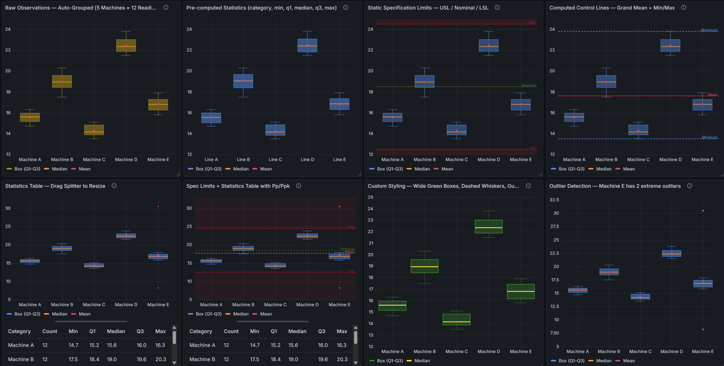
Table of Contents
- Why SPC Box Plot?
- Built for Grafana
- Features
- Use Cases
- Requirements
- Getting Started
- Data Modes
- Panel Options
- Control Lines
- Xf-Rf Control Chart
- Capability Indices
- Dashboard Variables
- Part of the KensoBI SPC Suite
- Getting Help
- License
Why SPC Box Plot?
Control charts and histograms show you one dimension of your process at a time. Box plots show you the entire distribution of each subgroup simultaneously — median, spread, quartiles, and individual outliers — making it easier to spot shifts in both location and variability across time or categories.
When combined with Statistical Process Control:
- Is my process centering stable? — Xf control limits show whether the typical location of each subgroup stays within expected bounds
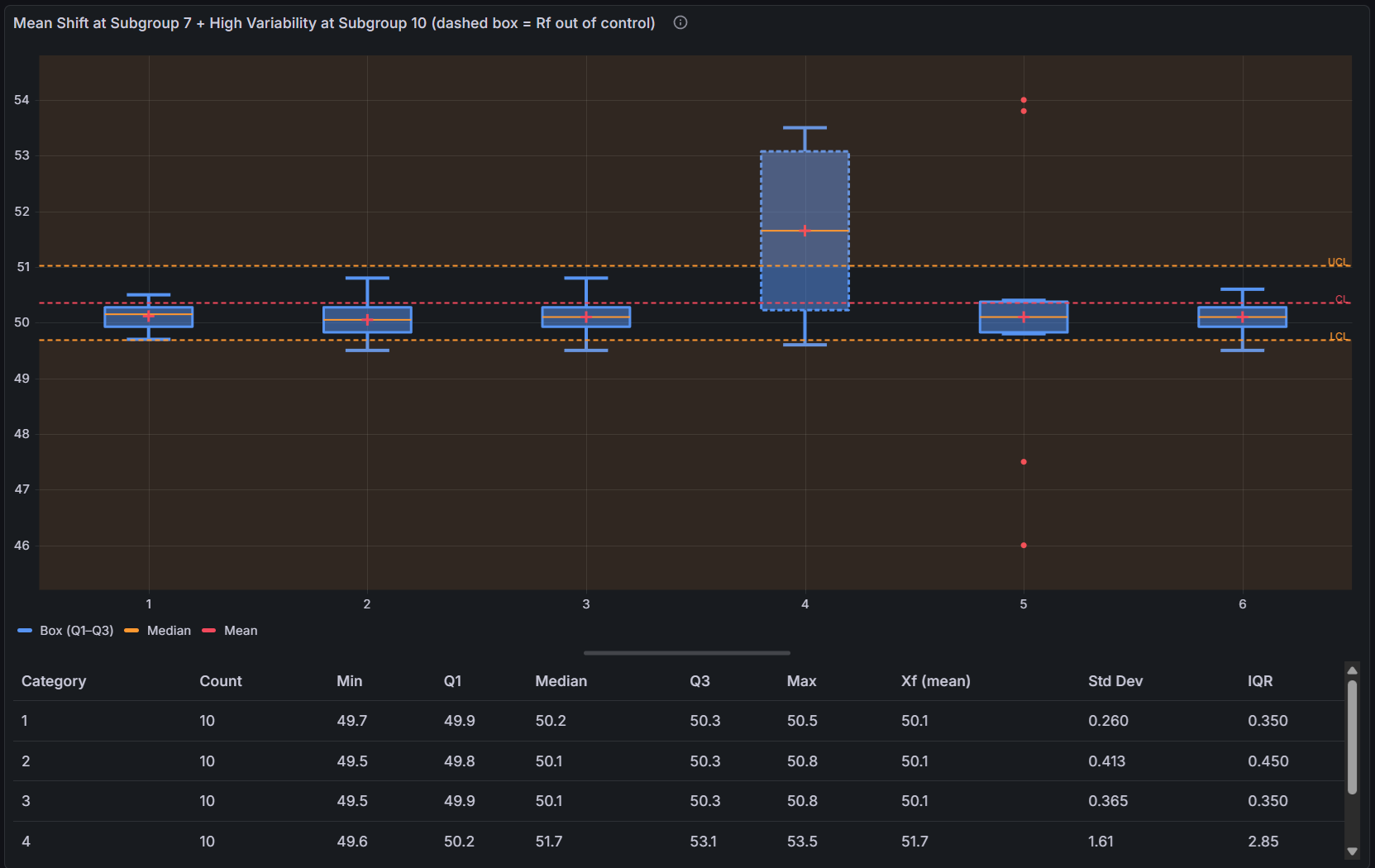
- Is my process spread stable? — Rf out-of-control flags reveal whether within-subgroup variability is in control
- Where are my outliers? — Individual points beyond the 1.5 × IQR fence are plotted separately so they stand out immediately
- What is my process capability? — Cp, Cpk, Pp, and Ppk are calculated automatically when LSL/USL control lines are added
Built for Grafana
SPC Box Plot is built using Grafana's native visualization components. This means it inherits the look, feel, and behavior you already know:
- Native theming — automatically adapts to light and dark mode
- Standard panel options — legend placement, tooltip behavior, and field overrides work just like any other Grafana panel
- Resizable statistics table — drag the splitter to balance chart and table space, just like Grafana's built-in panels
- Works with any data source — use it with SQL databases, Prometheus, InfluxDB, CSV files, or any other Grafana data source
Features
| Feature | Description |
|---|---|
| Box-and-whisker plots | Q1, Q3, median, whiskers (1.5 × IQR), and individual outlier points per subgroup |
| Mean marker | Optional marker at the subgroup mean, independent color and size |
| Outlier plotting | Data points beyond whisker bounds plotted as individual symbols |
| Three data modes | Auto-detects time series, categorical, or pre-computed input — no configuration needed |
| Xf-Rf SPC | Robust control limits using resistant estimators (Peixoto 1992/2003) |
| Control lines | LCL, UCL, Mean, Min, Max, Range, LSL, USL, Custom, Nominal |
| Fill regions | Color-fill areas between control lines to highlight process zones |
| Statistics table | n, Mean, Std Dev, Min, Max, Q1, Median, Q3, IQR, Cp, Cpk, Pp, Ppk, Xf (when SPC enabled) |
| Resizable layout | Drag the splitter between chart and statistics table |
| Dashboard variables | Control subgroup size across all panels with a subgroupsize dashboard variable |
| Interactive tooltip | Hover to see Q1, Median, Q3, Mean, Min, Max, and control line values |
Use Cases
- Manufacturing quality — compare distributions across shifts, machines, or product variants in the same view
- Process engineering — detect changes in process spread or centering across sequential time periods
- Laboratory testing — analyze batch-to-batch variability with full outlier visibility
- Supply chain — monitor delivery time or fill-rate distributions by supplier, carrier, or route
- Healthcare — track clinical measurement distributions across patient cohorts or time periods
Requirements
- Grafana 11.6.2 or later
Getting Started
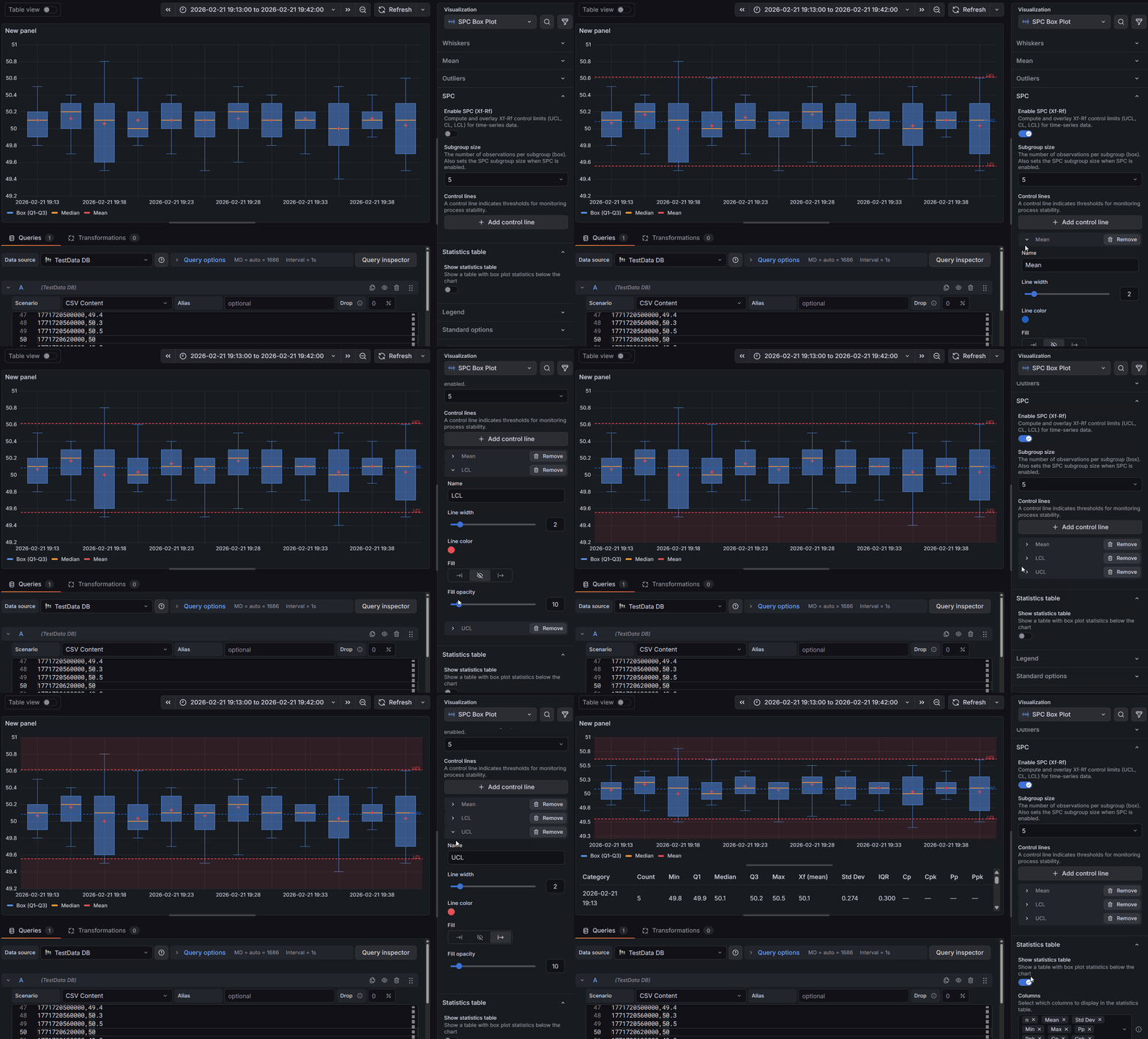
- Install the plugin from the Grafana Plugin Catalog.
- Add a new panel to your dashboard and select SPC Box Plot as the visualization type.
- Connect a data source that returns numeric time series data.
- The panel automatically groups consecutive measurements into subgroups (default size: 5) and displays one box per subgroup.
- In the panel editor, go to the SPC section and enable Enable SPC to add Xf-Rf control limits.
- Add an LCL and UCL control line to visualize the process control zone.
- Add LSL and USL control lines to enable capability index calculations (Cp/Cpk/Pp/Ppk) in the statistics table.
Data Modes
The panel automatically detects which input format your data is in. No manual mode selection is needed — the detection order is: pre-computed → categorical → time series.
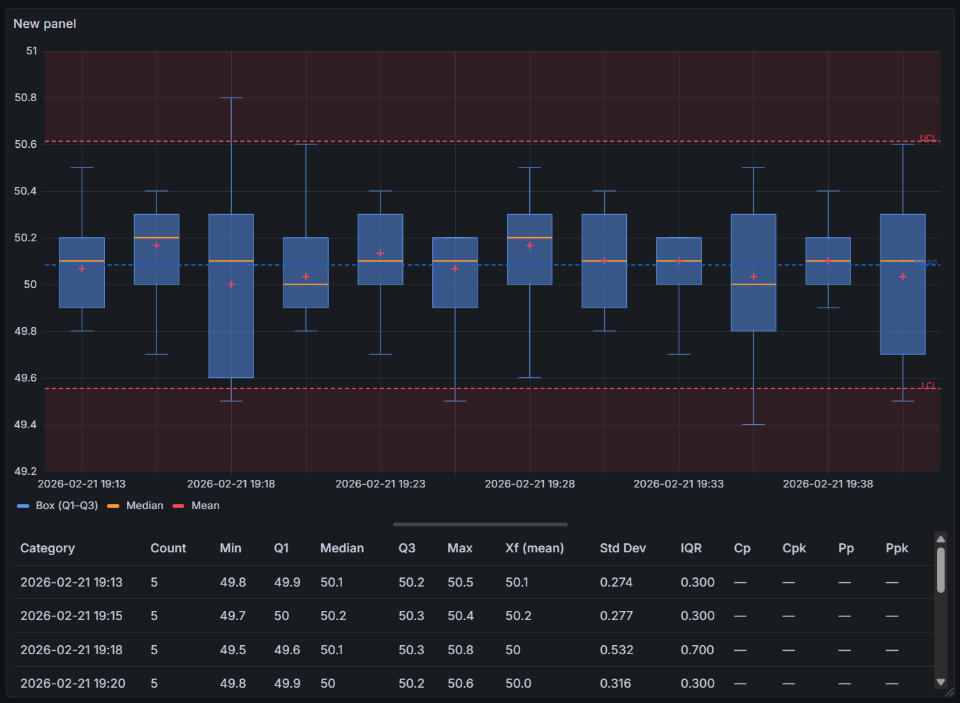
Time Series Mode
Trigger: Query returns a numeric field with no string field present.
Consecutive measurements are grouped into subgroups of the configured subgroup size. Each complete subgroup becomes one box. Incomplete trailing subgroups (fewer values than the subgroup size) are silently discarded.
Box labels use the timestamp of the first measurement in each subgroup, formatted as YYYY-MM-DD HH:mm. If no time field is present, a 1-based index is used instead.
SPC (Xf-Rf) is only available in this mode.
This is the primary mode for monitoring process stability over time.
Categorical Mode
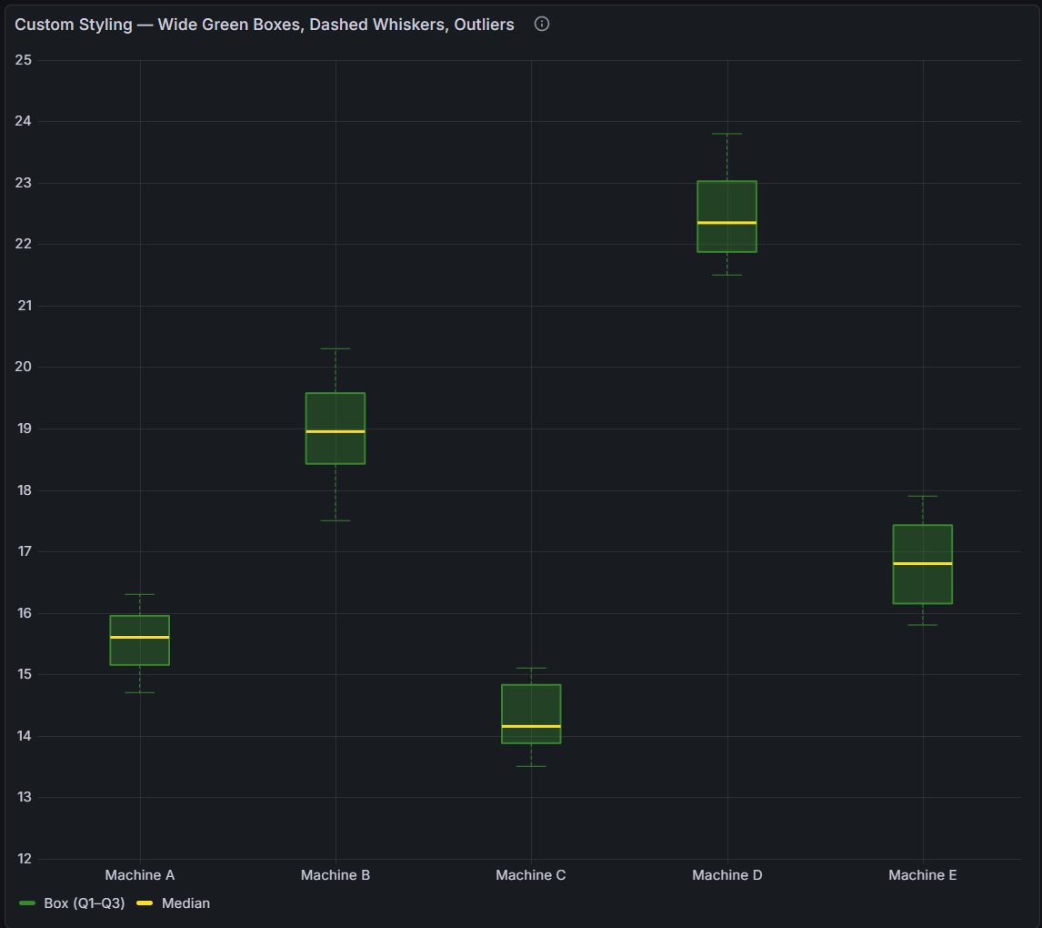
Trigger: Query returns a string field alongside a numeric field. The panel groups all rows with the same string value into one box.
Each unique category value becomes one box showing the full distribution of all numeric values in that category. Category order follows the order in which unique values are first encountered in the data.
Use this mode to compare distributions across:
- Products, materials, or part numbers
- Machine IDs or production lines
- Operators, shifts, or teams
- Any other discrete grouping dimension
Pre-computed Mode
Trigger: Query returns a string field plus numeric fields named min, q1, median, q3, and max (case-insensitive).
The panel renders the pre-computed statistics directly without recalculating anything. This is useful when your database or query already computes box plot statistics (for example, using SQL percentile_cont functions or a time series aggregation pipeline).
Required fields:
| Field | Required | Description |
|---|---|---|
| String field | Yes | Category label for each row |
min | Yes | Whisker minimum |
q1 | Yes | First quartile |
median | Yes | Median |
q3 | Yes | Third quartile |
max | Yes | Whisker maximum |
mean | No | Mean (estimated as (Q1+Q3)/2 if absent) |
count | No | Sample size shown in the statistics table |
When using pre-computed mode, the statistics table will show approximate values for standard deviation (estimated from IQR as IQR / 1.35, assuming a normal distribution). SPC is not available in this mode.
Panel Options
All SPC Box Plot options are grouped in the panel editor sidebar.
Box Appearance
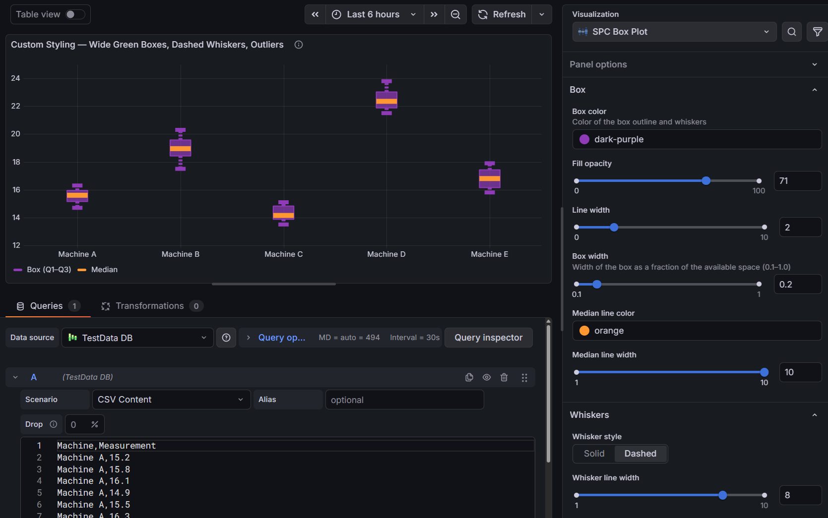
| Option | Description | Default |
|---|---|---|
| Box color | Fill and border color of the box body | Blue |
| Fill opacity | Transparency of the box fill (0–100%) | 50% |
| Line width | Box border thickness in pixels (1–10) | 1 |
| Box width | Fraction of available space each box occupies (0.1–1.0) | 0.6 |
| Median color | Color of the median line inside the box | Orange |
| Median line width | Thickness of the median line in pixels (1–10) | 2 |
Whiskers
| Option | Description | Default |
|---|---|---|
| Whisker style | Solid or Dashed line style | Solid |
| Whisker line width | Thickness of the whisker lines in pixels (1–10) | 1 |
Whiskers extend from Q1 downward and from Q3 upward to the farthest data point that is still within 1.5 × IQR of the respective quartile:
- Lower whisker: farthest value ≥ Q1 − 1.5 × IQR
- Upper whisker: farthest value ≤ Q3 + 1.5 × IQR
Any values outside these bounds are plotted as individual outlier points (if outlier display is enabled).
Mean Marker
| Option | Description | Default |
|---|---|---|
| Show mean | Display a marker at the subgroup mean | On |
| Mean color | Color of the mean marker | Red |
| Mean size | Diameter of the mean marker in pixels | 5 |
| Mean line width | Border thickness of the mean marker in pixels | 2 |
The mean marker appears as a diamond symbol overlaid on the box, allowing you to see at a glance whether the mean and median are aligned (symmetric distribution) or diverge (skewed distribution).
Outliers
| Option | Description | Default |
|---|---|---|
| Show outliers | Plot individual data points beyond the whisker bounds | On |
| Outlier color | Color of the outlier points | Red |
| Outlier size | Diameter of the outlier points in pixels | 4 |
Outlier points are plotted individually as circles. When multiple outliers have the same value they overlap, so very high-count distributions may show a column of stacked dots at the same position.
SPC (Xf-Rf)
SPC options are only available when the panel is in time series mode. The section is hidden for categorical and pre-computed data.
| Option | Description | Default |
|---|---|---|
| Enable SPC | Calculate and display Xf-Rf control limits | On |
| Subgroup size | Number of consecutive measurements per subgroup (4–15) | 5 |
When SPC is enabled:
- The LCL and UCL calculated control lines become available to add to the chart.
- Boxes whose Rf (range of the middle half) exceeds are flagged as out of control.
- The per-subgroup Xf column (mean of the middle half) appears in the statistics table.
- The sigma estimate is used instead of the sample standard deviation for Cp and Cpk calculations.
See Xf-Rf Control Chart for the full mathematical description.
Statistics Table
| Option | Description | Default |
|---|---|---|
| Show statistics table | Display the resizable statistics table below the chart | On |
| Visible columns | Select which columns appear in the table | All |
The statistics table shows one row per box (subgroup or category). It is sortable by clicking any column header. Drag the splitter between the chart and the table to adjust the vertical split.
Available columns:
| Column | Description |
|---|---|
| n | Sample count (number of values in the subgroup) |
| Mean | Arithmetic mean |
| Std Dev | Sample standard deviation (Bessel's correction, n−1 denominator) |
| Min | Minimum value (lower whisker bound) |
| Max | Maximum value (upper whisker bound) |
| Q1 | First quartile (25th percentile, linear interpolation) |
| Median | Median (50th percentile) |
| Q3 | Third quartile (75th percentile) |
| IQR | Interquartile range (Q3 − Q1) |
| Cp | Short-term potential capability index (requires LSL and USL control lines) |
| Cpk | Short-term centered capability index (requires LSL or USL) |
| Pp | Long-term performance capability index (requires LSL and USL) |
| Ppk | Long-term centered performance capability index (requires LSL or USL) |
| Xf | Per-subgroup mean of the middle half (only shown when SPC is enabled) |

Legend
Standard Grafana legend options are available:
- Display mode: List, Table, or Hidden
- Placement: Bottom or Right
- Values: Min, Max, Mean, and other standard reducers
The legend shows entries for each visible control line and for the box plot series name.
Control Lines
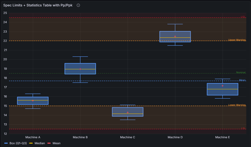
A control line is a horizontal reference line drawn across the entire chart at a specified Y-axis position. Lines can be calculated automatically from the data, manually specified as a fixed value, or pulled dynamically from a field in a data query.
Calculated Control Lines
Calculated lines are derived from the data. They update automatically when the data changes.
| Line | Description | Availability | Default color |
|---|---|---|---|
| LCL | Lower Control Limit (Xf-Rf) | Only when SPC is enabled | Red |
| UCL | Upper Control Limit (Xf-Rf) | Only when SPC is enabled | Red |
| Mean | Grand mean of all values | Always | Dark Blue |
| Min | Global minimum value | Always | Blue |
| Max | Global maximum value | Always | Blue |
| Range | Global max minus global min | Always | Purple |
Each calculated line type can only be added once per panel. When you enable SPC, LCL, UCL, and Mean are not added automatically — you add them explicitly from the control line editor.
Custom Control Lines
Custom lines are set to a fixed value or read from a data series. Multiple lines of the same type can be added.
| Line Type | Description | Default color |
|---|---|---|
| Custom | A general-purpose reference line | Dark Green |
| Nominal | The target or nominal process value | Dark Green |
| LSL | Lower Specification Limit — enables Cp/Cpk/Pp/Ppk calculation | Dark Red |
| USL | Upper Specification Limit — enables Cp/Cpk/Pp/Ppk calculation | Dark Red |
Control Line Appearance
Each control line has the following configurable properties:
| Property | Description |
|---|---|
| Name | Display name shown in the legend and tooltip |
| Position | Y-axis value where the line is drawn (Static mode) |
| Line width | Line thickness in pixels (1–10) |
| Color | Line color — uses Grafana's color picker |
| Fill direction | Below (−1), None (0), or Above (+1) |
| Fill opacity | Opacity of the filled region (0–100%) |
Fill Regions
Setting Fill direction to Above or Below creates a shaded region extending from the line outward. The fill is clipped at the nearest adjacent control line, so placing fill on both LCL (Above) and UCL (Below) creates a shaded band between the two lines.
Common pattern — highlight the in-control zone:
- Add an LCL line, set Fill Direction to Above with a low opacity (e.g., 10%).
- Add a UCL line, set Fill Direction to Below with the same opacity.
The two fills overlap between the lines, producing a visible band marking the acceptable process range.
Xf-Rf Control Chart
The SPC Box Plot implements the Xf-Rf resistant control chart described in:
Peixoto, J. L. (1992). A property of well-formulated polynomial regression models. The American Statistician. Later applied to resistant estimators for Shewhart-type box plot control charts (2003), distributed as technical report COB03-1499.
This chart type is specifically designed for subgroup data where individual observations within each subgroup may contain outliers.
Why Resistant Estimators?
Traditional Xbar-R charts estimate process location with the subgroup mean () and process spread with the subgroup range (R). Both statistics are sensitive to extreme values — a single outlier in a subgroup inflates both the mean and the range, producing control limits that are too wide and may mask genuine process signals.
The Xf-Rf chart replaces these with resistant estimators based on the middle half of each sorted subgroup:
- Xf (mean of the middle half) estimates the subgroup center without being pulled by the most extreme values
- Rf (range of the middle half) estimates the subgroup spread using only the central portion of the data
By discarding the outermost quarter of values on each side before computing each statistic, both estimators become robust. A small number of extreme observations within a subgroup cannot meaningfully bias the resulting control limits. This makes the Xf-Rf chart particularly well suited to box plot panels, where you want to distinguish between within-subgroup outliers (visible as individual dots on the box plot) and between-subgroup shifts in location or spread (visible as Xf control limit violations).
Middle-Half Index f
For a subgroup of size n, the boundary index f is computed as:
This determines which order statistics bound the "middle half". For example:
- n = 5: f = ⌊8/2⌋/2 = 4/2 = 2.0 (integer) → use order statistics X_(2) through X_(4)
- n = 4: f = ⌊7/2⌋/2 = 3/2 = 1.5 (half-integer) → use fractional order statistics at positions 1.5 and 3.5
Xf — Mean of Middle Half
Case 1: f is an integer
Xf = mean of X_(f), X_(f+1), ..., X_(n+1−f) (using 1-based order statistics)
Case 2: f is a half-integer (f = i + ½)
Fractional order statistics are linearly interpolated:
Rf — Range of Middle Half
For half-integer f, the boundary order statistics are interpolated from adjacent pairs as described above.
Control Limits
After computing Xf and Rf for every subgroup, the chart averages across all k subgroups:
The control limits for the Xf chart (monitoring subgroup location) are:
| Line | Formula |
|---|---|
| Center Line (CL) | |
| UCL | |
| LCL |
The control limits for the Rf chart (monitoring subgroup spread — used for flagging only, not displayed as separate lines):
| Line | Formula |
|---|---|
| Center Line | |
| UCL (Rf) | |
| LCL (Rf) |
Sigma Estimate
The within-subgroup process standard deviation is estimated as:
This resistant sigma estimate is used in the Cp and Cpk capability index calculations when SPC is enabled.
Out-of-Control Detection
A subgroup is flagged as out of control when its Rf value falls outside the Rf control limits:
Flagged boxes are visually highlighted on the chart.
The current implementation flags based on spread (Rf) out-of-control only. Location (Xf) violations are visible from the UCL/LCL control lines but are not separately flagged with a visual marker.
Xf-Rf Constants Table
The constants A2F, D3F, D4F, and d4 are taken from Table 2 of Peixoto (2003). The implementation is valid for subgroup sizes n = 4 to 15. Subgroup sizes outside this range are not supported (SPC will not activate).
| n | A2F | D3F | D4F | d4 |
|---|---|---|---|---|
| 4 | 1.131 | 0.000 | 2.325 | 1.326 |
| 5 | 1.444 | 0.000 | 2.723 | 0.990 |
| 6 | 1.003 | 0.000 | 2.378 | 1.283 |
| 7 | 1.074 | 0.000 | 2.226 | 1.110 |
| 8 | 0.840 | 0.000 | 2.072 | 1.325 |
| 9 | 0.939 | 0.000 | 2.225 | 1.143 |
| 10 | 0.770 | 0.000 | 2.082 | 1.312 |
| 11 | 0.816 | 0.000 | 2.005 | 1.190 |
| 12 | 0.696 | 0.084 | 1.916 | 1.329 |
| 13 | 0.774 | 0.000 | 2.003 | 1.205 |
| 14 | 0.649 | 0.080 | 1.920 | 1.323 |
| 15 | 0.681 | 0.128 | 1.872 | 1.230 |
Notation:
- A2F — multiplier for Xf control limits: UCL/LCL =
- D3F — lower multiplier for Rf control limits: LCL(Rf) =
- D4F — upper multiplier for Rf control limits: UCL(Rf) =
- d4 — divisor for sigma estimate:
Capability Indices
When LSL (Lower Specification Limit) and/or USL (Upper Specification Limit) control lines are configured, the statistics table automatically calculates process capability indices for each subgroup row.
| Index | Formula | Description |
|---|---|---|
| Cp | Short-term potential capability. Measures whether the process spread fits within the specification window, ignoring centering. Requires both LSL and USL. | |
| Cpk | Short-term centered capability. Accounts for how well the process is centered relative to the specification limits. Requires at least one of LSL or USL. | |
| Pp | Long-term performance capability. Uses the sample standard deviation s instead of . Represents actual observed performance over the full data range. Requires both LSL and USL. | |
| Ppk | Long-term centered performance capability. Accounts for centering using long-term variability. |
Notation:
- μ = subgroup mean
- = resistant sigma estimate from Xf-Rf (); falls back to sample StdDev if SPC is disabled
- s = sample standard deviation (n−1 denominator)
Interpretation guidance:
| Value | Interpretation |
|---|---|
| Cp/Cpk < 1.00 | Process is not capable — producing output outside specification |
| 1.00 ≤ Cp/Cpk < 1.33 | Marginally capable — acceptable only for non-critical characteristics |
| 1.33 ≤ Cp/Cpk < 1.67 | Capable — meets most industry requirements |
| Cp/Cpk ≥ 1.67 | Highly capable |
Note that Cpk ≤ Cp always. A large difference between Cp and Cpk indicates the process is capable but poorly centered.
Dashboard Variables
The panel supports a dashboard variable named subgroupsize (case-insensitive — subgroupsize, subgroupSize, and SUBGROUPSIZE all work). When this variable exists on the dashboard, it overrides the subgroup size setting in every SPC Box Plot panel, allowing you to adjust subgrouping for an entire dashboard from a single dropdown.
To configure the variable:
- Go to Dashboard Settings > Variables.
- Click Add variable.
- Set Name to
subgroupsize. - Set Type to Custom.
- In the Custom options field, enter a comma-separated list of valid sizes, for example:
4,5,6,7,8,10. - Save the dashboard.
All SPC Box Plot panels will immediately reflect the selected variable value. When the variable is active, the subgroup size field in the panel editor is disabled and shows the variable's current value.
Subgroup sizes must be between 4 and 15 for SPC to activate. Values outside this range are accepted by the variable but will disable SPC calculations.
Part of the KensoBI SPC Suite
SPC Box Plot is part of a growing family of Statistical Process Control plugins for Grafana by Kenso Software:
SPC Characteristic Datasource — The datasource that powers the SPC CAD panel. Connects to your measurement database (PostgreSQL or MSSQL), lets you select features and characteristics through a point-and-click interface, and returns SPC statistics, time series measurements, and forecast data — no SQL required.
SPC CAD Panel — Brings 3D geometry into the picture, letting you bind the data from control charts and histograms to physical features on your parts.
SPC Chart Panel — Control charts for monitoring process stability over time. Supports XmR, Xbar-R, and Xbar-S charts with automatic calculation of control limits. If you're tracking whether a process is staying in control, start here.
SPC Histogram Panel — Distribution analysis with histograms, bell curves, and a built-in statistics table showing Cp, Cpk, Pp, and Ppk. Use it to understand process capability: is your process producing results within specification limits?
SPC Bullet Panel — Compact bullet charts and progress bars with optional SPC metrics (Cpk, Cp, Ppk, Pp, Sigma Level) for dense KPI dashboards.
SPC Pareto Panel — Pareto charts for identifying the most significant factors contributing to defects or issues. Automatic sorting, cumulative percentage lines, and 80/20 threshold analysis help you focus improvement efforts where they matter most.
Getting Help
- Contact support at https://kensobi.com/contact
- Join the KensoBI Discord for questions and discussion.
License
This software is distributed under the Kenso Software Commercial License. Use requires a valid commercial license.