Control Chart
SPC Histogram calculates control chart statistics from time series data and displays them as histograms. It supports XmR, Xbar-R, and Xbar-S chart types, along with customizable control lines and aggregation options for process monitoring and analysis.
Chart Types
You can select a chart type in Editor > SPC > Chart type. Each chart type automatically calculates and displays the appropriate control limits (LCL, UCL) and mean as vertical lines on the histogram.
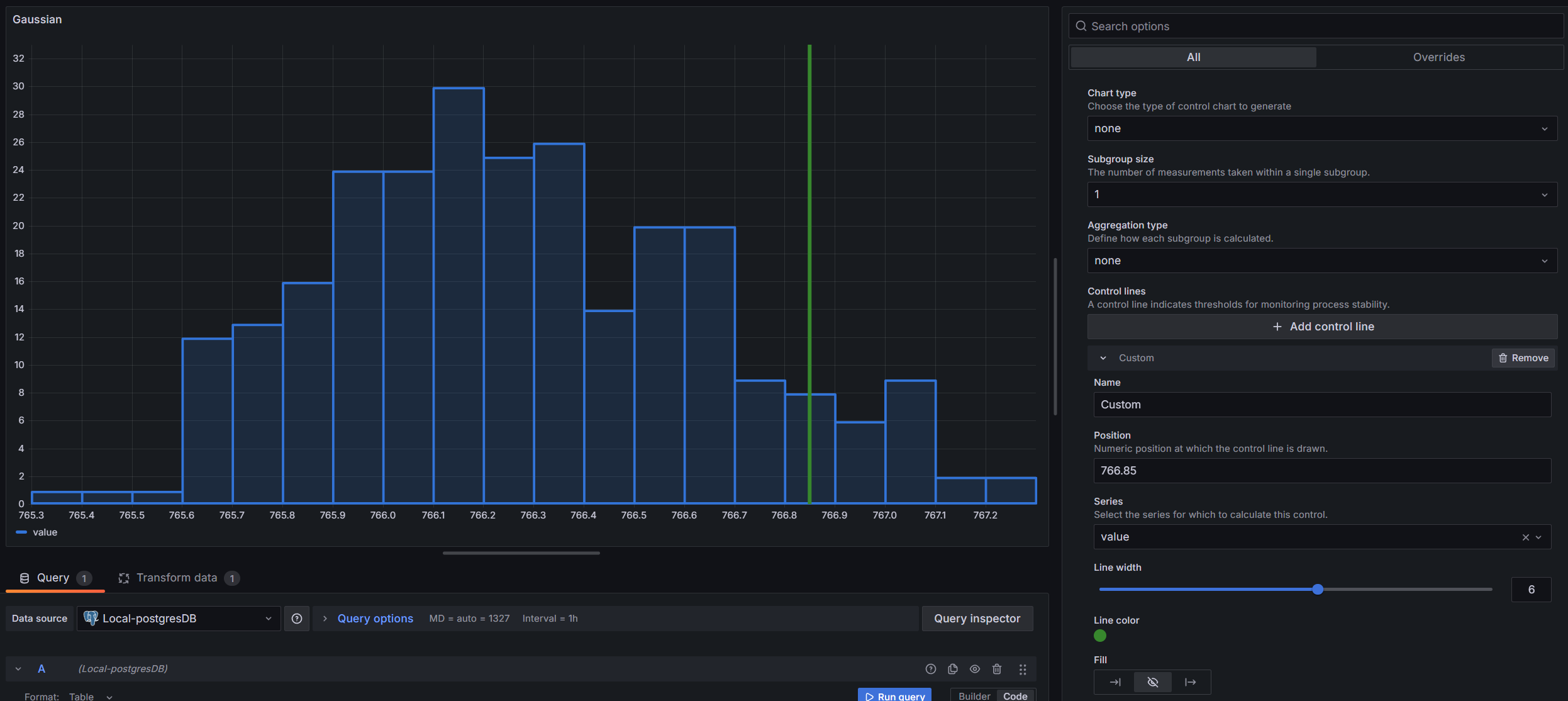
When set to none, no control chart calculations are performed, and you get a plain histogram. You can still add custom control lines and use aggregation in this mode.
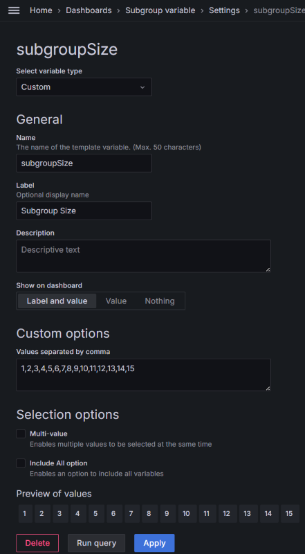
XmR Control Chart
The XmR chart (also called Shewhart's chart or I-MR) is the most common starting point. Use it when you have individual measurements — one data point at a time — rather than samples taken in groups. This is typical for automated processes, daily measurements, or any situation where grouping doesn't make sense.
It produces two chart views:
Individual (X) Chart — Shows each data point, helping you see whether the process stays centered around its mean value.
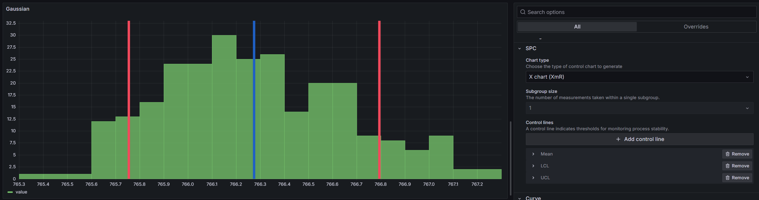
Moving Range (mR) Chart — Shows the difference between consecutive readings. This reveals changes in process variability. Spikes in the moving range suggest something unusual happened between those two readings.
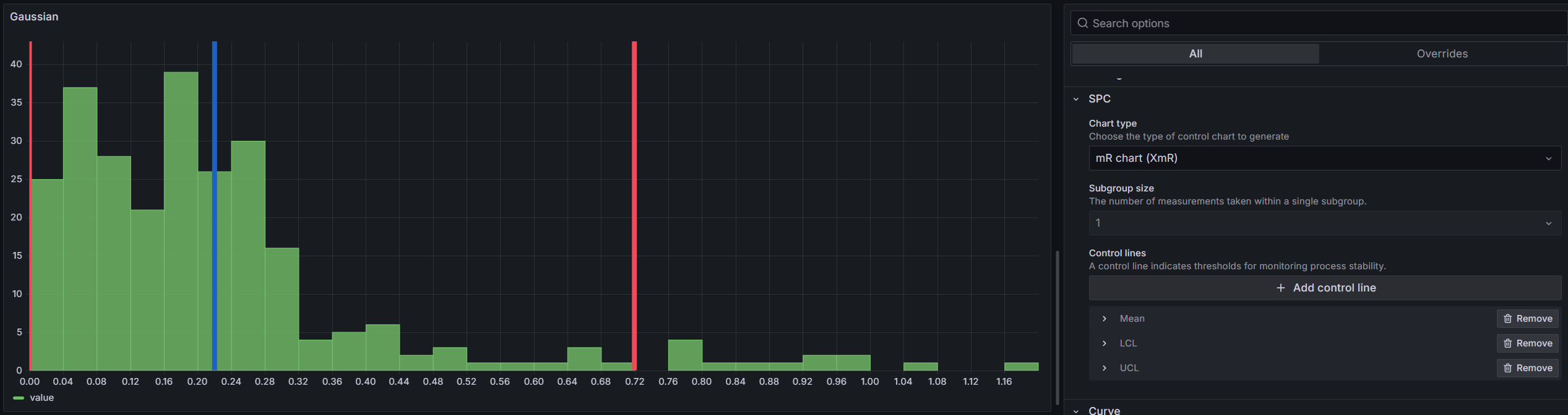
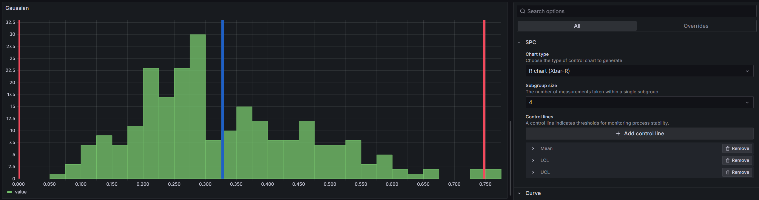
Xbar-R Control Chart
Use the Xbar-R chart when you collect data in small subgroups (typically 2-10 samples per group). For example, if you measure 5 parts every hour, each hour's measurements form a subgroup.
Set the Subgroup size in Editor > SPC to match your sampling plan.
X-bar Chart — Plots the average of each subgroup. The control limits are calculated from the average range across all subgroups.
R-bar Chart — Plots the range (largest minus smallest) within each subgroup. This monitors whether the variability within your subgroups stays consistent.
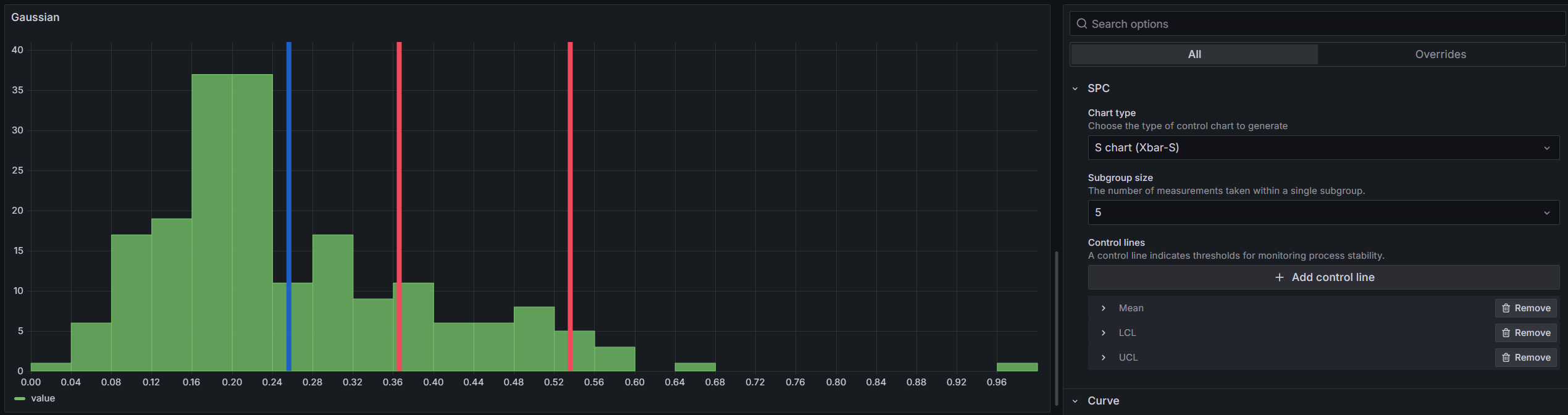
Xbar-S Control Chart
The Xbar-S chart works like Xbar-R but uses standard deviation instead of range to measure variability. It's preferred for larger subgroup sizes (more than 10) because standard deviation uses all data points in the subgroup, while range only uses the two extremes.
X-bar Chart — Same concept as in Xbar-R, but with control limits calculated using the average standard deviation.

S-bar Chart — Plots the standard deviation of each subgroup over time.
Control Lines
A control line is a vertical line on the histogram that marks a limit or threshold. You can use automatically calculated control lines or add your own custom values.
Calculated
These control lines are computed from the dataset. Select them in Editor > SPC > Control Lines > Add Control Line:
| Control Line | Description |
|---|---|
| LCL | Lower Control Limit — the lower boundary of the control chart |
| UCL | Upper Control Limit — the upper boundary of the control chart |
| Mean | Average of all sample values |
| Min | Smallest value in the dataset |
| Max | Largest value in the dataset |
| Range | Difference between the largest and smallest values |
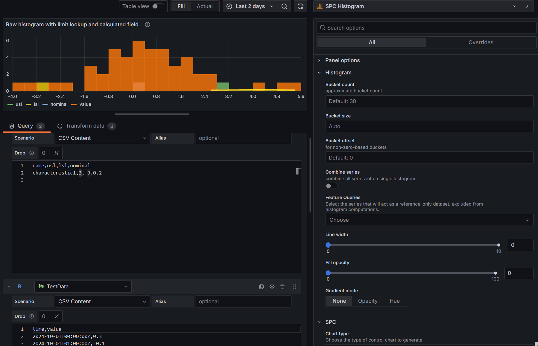
| LSL | Lower Specification Limit — used for capability index calculations |
| USL | Upper Specification Limit — used for capability index calculations |
Custom
There are two types of custom control lines:
Static value — You manually enter a fixed number for the line position. Use this when you have a known specification limit or target value.
Feature series — The line's value is pulled dynamically from a separate query in your data source. This is useful when your limits come from a database or calculation rather than being fixed numbers.
How to set up a feature series control line:
-
Set up your queries — Create at least two queries: one for the histogram data and another for the reference values (such as specification limits).
-
Mark the reference query as a feature query — Go to Editor > Histogram > Feature Queries and select the query that contains your reference data. This prevents it from being included in the histogram calculations.
-
Add a control line — Click Add Control Line and select Custom. In the Series dropdown, choose the query with your reference data.
-
Select the field — Under Position Input, select Series. A Position dropdown will appear showing all numeric fields from that query. Pick the field that contains your limit value.
-
The selected value will appear as a vertical line on the histogram.
If the selected field returns more than one value, the histogram uses the last value for the control line position.
Always mark your reference queries as Feature Queries. This prevents them from affecting the histogram data calculations.
Visualization
You can customize the appearance of each control line:
| Option | Description |
|---|---|
| Name | Display name shown on the histogram |
| Position | X-axis value where the line is drawn |
| Series | Which data series the line applies to (when you have multiple series) |
| Line width | Line thickness (0-10) |
| Color | Line color |
| Fill | Left fill, no fill, or right fill — shades the area on one side of the line |
| Fill Opacity | Transparency of the fill area |
Aggregation
When the chart type is set to none, you can choose an Aggregation Type in the editor. This transforms your raw data before building the histogram.
The available aggregation types depend on the Subgroup Size:
Subgroup size = 1:
- None — use raw values as-is
- Moving range — use the difference between consecutive values
Subgroup size > 1:
- Mean — average of each subgroup
- Range — difference between the largest and smallest values in each subgroup
- Standard Deviation — standard deviation within each subgroup
For example, with a subgroup size of 5 and Mean aggregation, the data is split into groups of 5 consecutive points, the average of each group is calculated, and the histogram is built from those averages.
Dashboard Variable
You can control the subgroup size across multiple SPC Histogram panels using a single Grafana dashboard variable. Create a dashboard variable named subgroupSize, and all SPC Histogram panels on that dashboard will use its value automatically.