Bell Curve
The SPC Histogram can overlay a bell curve on the histogram. This helps you see how closely your data follows a normal distribution and quickly spot any skewness or unusual patterns.
You can add bell curves in Editor > Curve > Add a Bell Curve.
Gaussian Curve

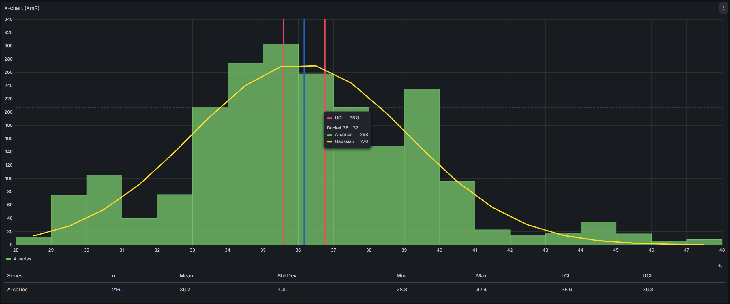
The Gaussian curve fits an ideal normal distribution to your data. It shows what your data would look like if it were perfectly normally distributed, making it easy to compare against the actual histogram bars.
The curve is fitted using the Levenberg-Marquardt algorithm, which adjusts three parameters — height, center, and spread — until the curve matches your histogram as closely as possible. The implementation uses the ml-levenberg-marquardt library.
Histogram Curve
The histogram curve is a simpler visualization that connects the midpoints of each histogram bar with a smooth line. Unlike the Gaussian curve, it doesn't try to fit a mathematical model — it just shows the actual shape of your data distribution in a cleaner way.
This is useful when your data doesn't follow a normal distribution and you want to see its true shape without the noise of individual bars.
Visualization
You can customize the appearance of each bell curve:
| Option | Description |
|---|---|
| Fit | Choose between Gaussian or Histogram curve fitting |
| Series | Which data series to calculate the curve for (when you have multiple series) |
| Line width | Line thickness (0-10) |
| Color | Curve line color |