SPC Histogram
Visualize your process data distributions with built-in Statistical Process Control — right inside Grafana.
SPC Histogram turns your time series data into interactive histograms with automatic control limits, bell curves, capability indices, and a detailed statistics table. Whether you're monitoring manufacturing tolerances, tracking measurement stability, or analyzing process performance, this panel gives you the tools to understand your data at a glance.
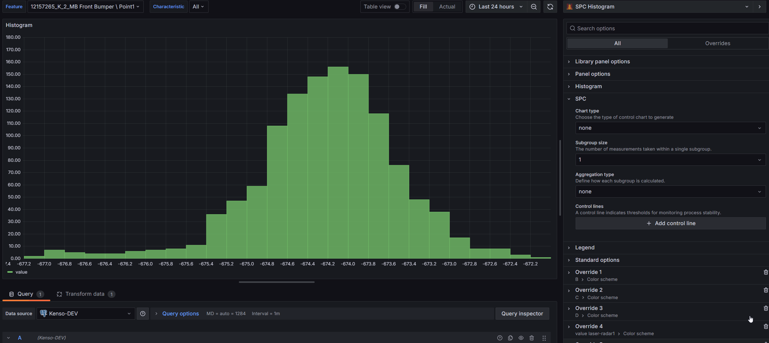
Table of Contents
- Why SPC Histogram?
- Built for Grafana
- Features
- Use Cases
- Requirements
- Getting Started
- Histogram
- Control Chart
- Bell Curves
- Statistics Table
- Export to CSV
- Interactive Tooltips
- Configuration Reference
- Part of the KensoBI SPC Suite
- License
- Support
Why SPC Histogram?
Histograms are a fundamental tool for understanding process data. When combined with Statistical Process Control, they answer the key questions about your process:
- Is the process stable? — Control limits (LCL/UCL) calculated from your data show whether variation is within expected bounds
- Is the process capable? — Capability indices (Cp, Cpk, Pp, Ppk) tell you whether your process fits within specification limits
- Is the data normally distributed? — Gaussian bell curves fitted using the Levenberg-Marquardt algorithm reveal how closely your data follows a normal distribution
- Where is the process centered? — Mean lines and specification limits show whether your process is on target
Built for Grafana
SPC Histogram is built using Grafana's native visualization components. This means it inherits the look, feel, and behavior you already know:
- Native theming — automatically adapts to light and dark mode
- Standard panel options — legend placement, tooltip behavior, and field overrides work just like any other Grafana panel
- Resizable statistics table — drag the splitter to balance chart and table space, just like Grafana's built-in panels
- Works with any data source — use it with SQL databases, Prometheus, InfluxDB, CSV files, or any other Grafana data source
Features
| Feature | Description |
|---|---|
| Control charts | XmR, Xbar-R, and Xbar-S chart types with automatic LCL/UCL calculation |
| Bell curves | Gaussian (Levenberg-Marquardt fit) and histogram curve overlays |
| Statistics table | n, Mean, Std Dev, Min, Max, LCL, UCL, Cp, Cpk, Pp, Ppk per series |
| Custom control lines | Static values or dynamic values pulled from a separate query |
| Specification limits | LSL/USL with automatic capability index calculation |
| Multiple series | Compare distributions side by side or combine into one histogram |
| Feature queries | Exclude reference queries from histogram calculations |
| Aggregation | Mean, Range, Standard Deviation, and Moving Range aggregation modes |
| Export to CSV | Export statistics, control lines, and histogram buckets to CSV |
| Interactive tooltips | Bucket counts, control line values, and Gaussian curve values on hover |
| Resizable layout | Drag the splitter between chart and statistics table |
Use Cases
| Domain | Example |
|---|---|
| Manufacturing quality | Monitor dimensional tolerances with control limits and capability indices |
| Process engineering | Track measurement stability and detect shifts in process centering |
| Laboratory testing | Analyze instrument measurement distributions and repeatability |
| Supply chain | Monitor incoming material quality against specification limits |
| Pharmaceutical | Validate process capability for batch manufacturing (Cp/Cpk) |
| Semiconductor | Track critical dimension distributions across wafer lots |
Requirements
- Grafana 11 or later
Getting Started
- Install the plugin from the Grafana Plugin Catalog
- Add a new panel and select SPC Histogram as the visualization
- Connect a data source with time series data
- Choose a Chart Type (XmR, Xbar-R, or Xbar-S) in Editor > SPC to enable automatic control limits
- Add Control Lines for specification limits (LSL/USL) to see capability indices
- Add a Bell Curve in Editor > Curve to visualize the distribution fit
- Enable the Statistics Table to see detailed metrics below the histogram
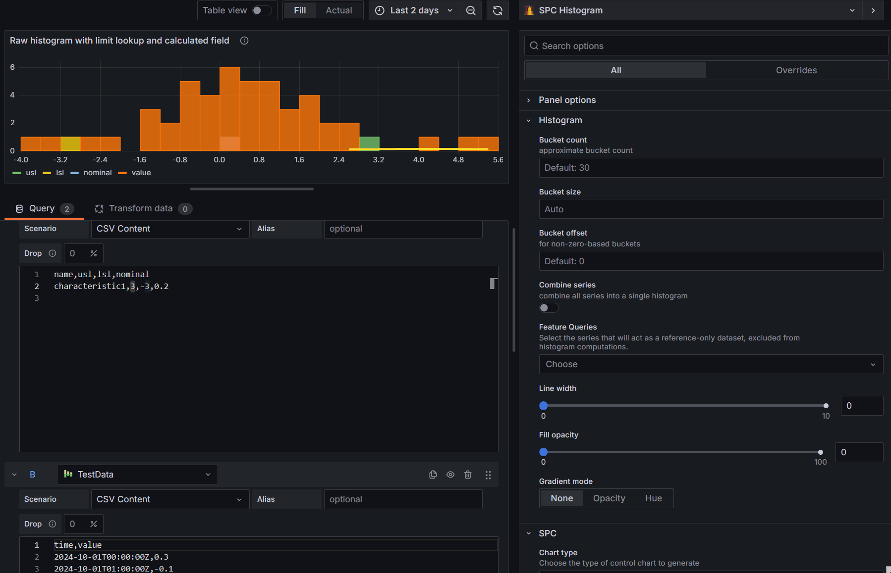
📊 Histogram
The SPC Histogram panel displays time series data as a histogram — a bar chart that shows how often values fall into specific ranges (called buckets). This is the foundation for all other features like control charts, bell curves, and the statistics table.
Bucket Settings
Configure how the histogram groups your data in Editor > Histogram:
| Option | Description | Default |
|---|---|---|
| Bucket count | Approximate number of bars in the histogram. The actual count may differ slightly to produce clean bucket boundaries. | 30 |
| Bucket size | Fixed width for each bucket. When set, this overrides the bucket count. Leave on "Auto" to let the panel calculate an appropriate size. | Auto |
| Bucket offset | Shifts the bucket boundaries by a fixed amount. Useful when your data doesn't start at zero and you want buckets aligned to specific values. | 0 |
Combine Series
When you have multiple data series, the Combine series toggle merges them into a single histogram. This is useful when you want to see the overall distribution across all series rather than comparing them side by side.
When turned off (the default), each series gets its own set of histogram bars with a distinct color.
Feature Queries
If you have additional queries in your data source that provide reference values (like specification limits or targets) rather than histogram data, mark them as Feature Queries in Editor > Histogram > Feature Queries.
Feature queries are excluded from the histogram calculations. Their data is only used when you reference them in custom control lines (see Custom control lines for details).
Always mark your reference queries as Feature Queries. This prevents them from affecting the histogram data calculations.
Appearance
You can customize the look of the histogram bars under field overrides or the defaults section:
| Option | Description | Default |
|---|---|---|
| Line width | Border thickness of each bar (0–10) | 1 |
| Fill opacity | Transparency of the bar fill (0–100%) | 80 |
| Gradient mode | Apply a gradient effect to the bar fill. Options: None, Opacity, Hue. | None |
📈 Control Chart
SPC Histogram calculates control chart statistics from time series data and displays them as histograms. It supports XmR, Xbar-R, and Xbar-S chart types, along with customizable control lines and aggregation options for process monitoring and analysis.
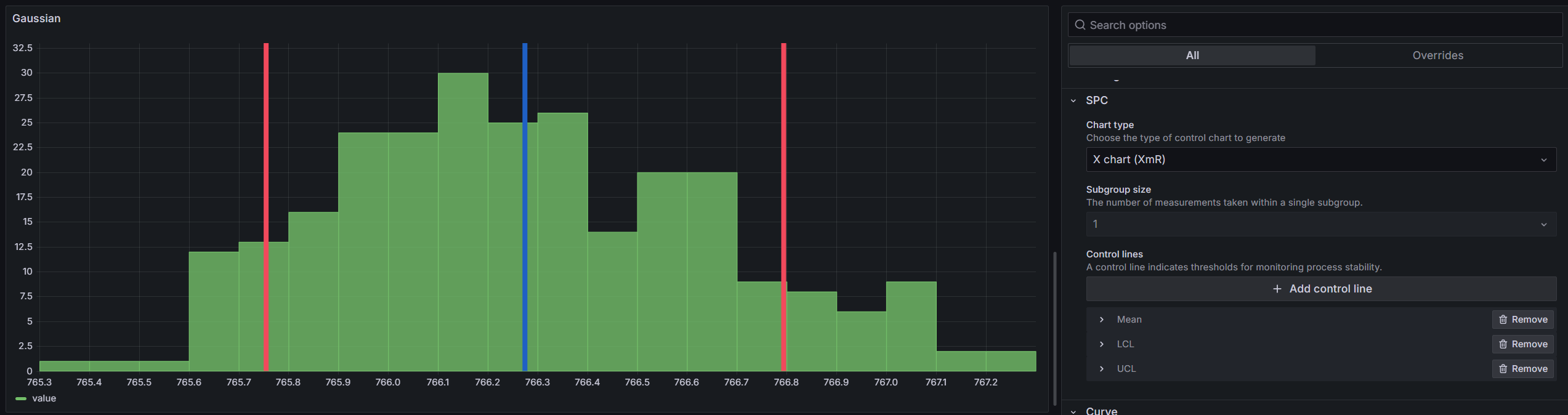
Chart Types
You can select a chart type in Editor > SPC > Chart type. Each chart type automatically calculates and displays the appropriate control limits (LCL, UCL) and mean as vertical lines on the histogram.
When set to none, no control chart calculations are performed, and you get a plain histogram. You can still add custom control lines and use aggregation in this mode.
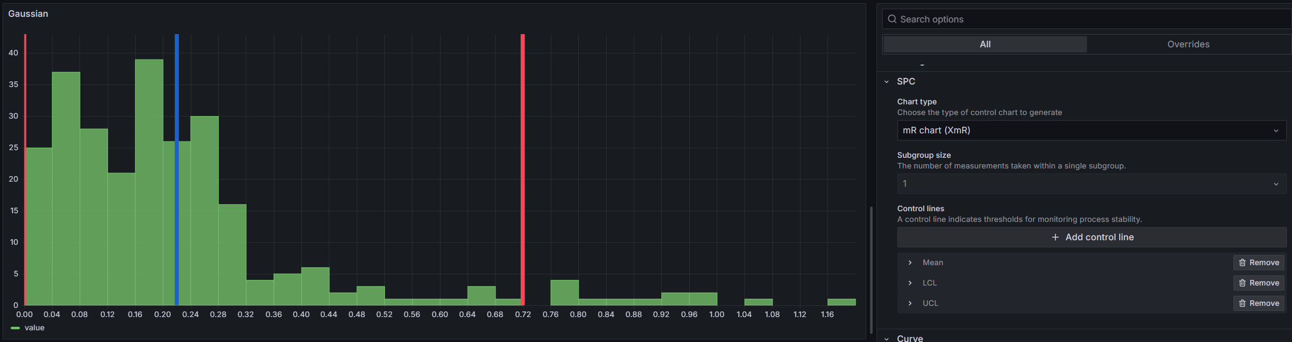
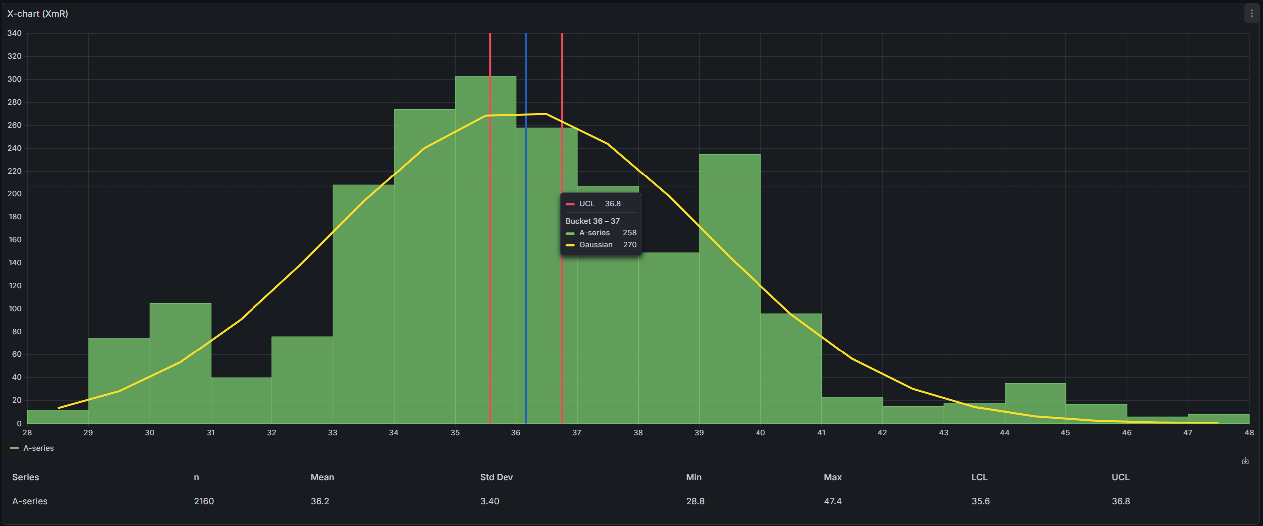
XmR Control Chart
The XmR chart (also called Shewhart's chart or I-MR) is the most common starting point. Use it when you have individual measurements — one data point at a time — rather than samples taken in groups. This is typical for automated processes, daily measurements, or any situation where grouping doesn't make sense.
It produces two chart views:
Individual (X) Chart — Shows each data point, helping you see whether the process stays centered around its mean value.
Moving Range (mR) Chart — Shows the difference between consecutive readings. This reveals changes in process variability. Spikes in the moving range suggest something unusual happened between those two readings.
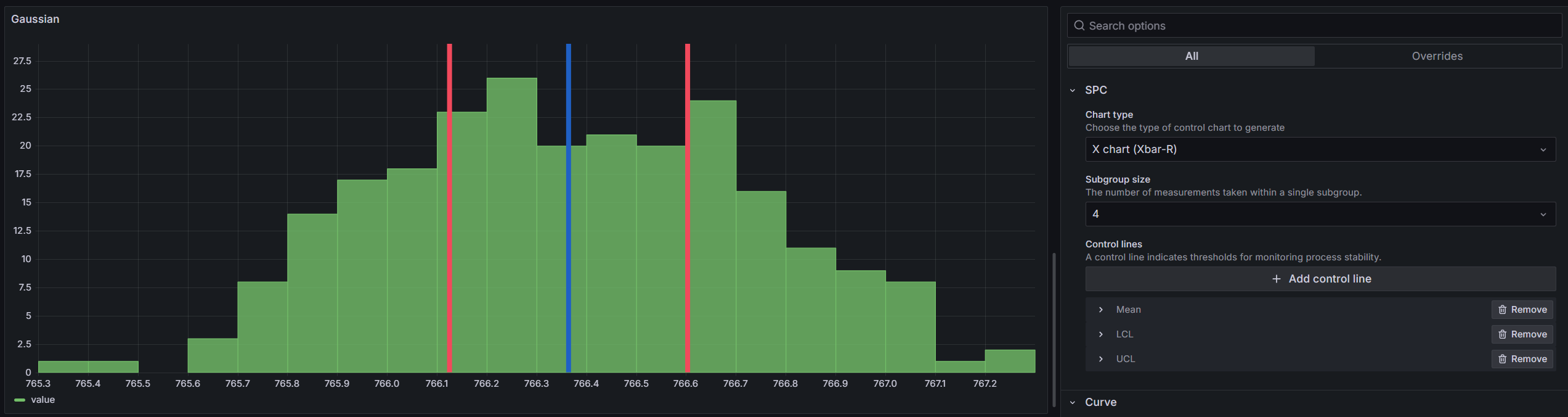
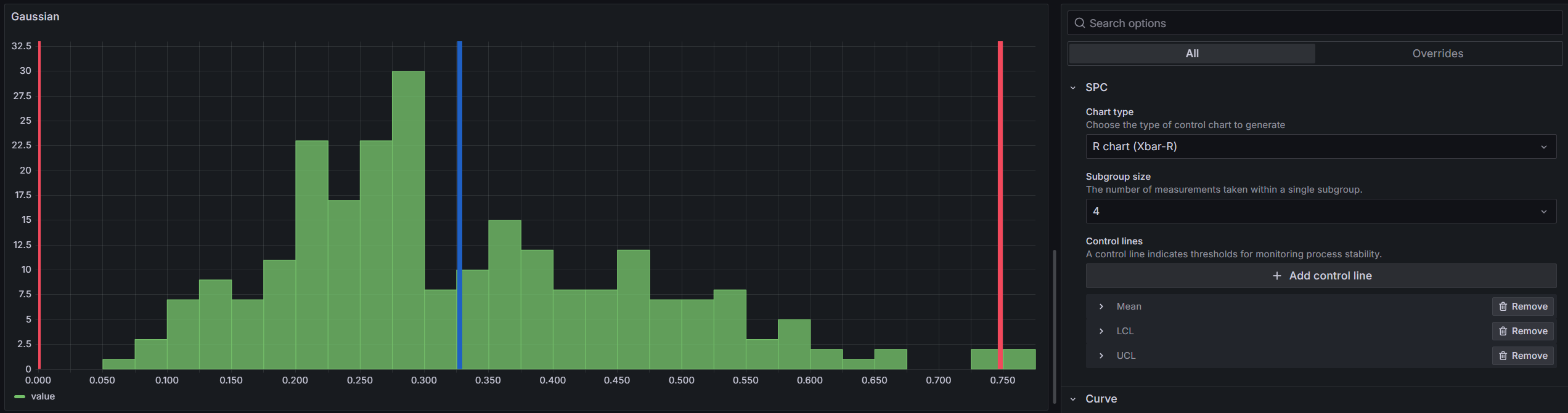
Xbar-R Control Chart
Use the Xbar-R chart when you collect data in small subgroups (typically 2–10 samples per group). For example, if you measure 5 parts every hour, each hour's measurements form a subgroup.
Set the Subgroup size in Editor > SPC to match your sampling plan.
X-bar Chart — Plots the average of each subgroup. The control limits are calculated from the average range across all subgroups.
R-bar Chart — Plots the range (largest minus smallest) within each subgroup. This monitors whether the variability within your subgroups stays consistent.
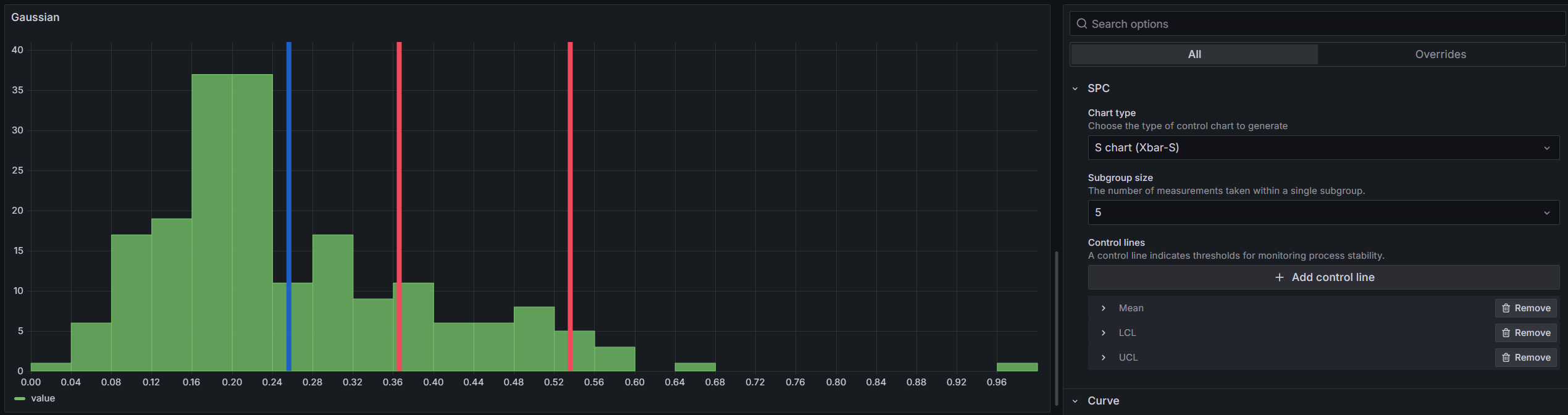
Xbar-S Control Chart
The Xbar-S chart works like Xbar-R but uses standard deviation instead of range to measure variability. It's preferred for larger subgroup sizes (more than 10) because standard deviation uses all data points in the subgroup, while range only uses the two extremes.
X-bar Chart — Same concept as in Xbar-R, but with control limits calculated using the average standard deviation.

S-bar Chart — Plots the standard deviation of each subgroup over time.
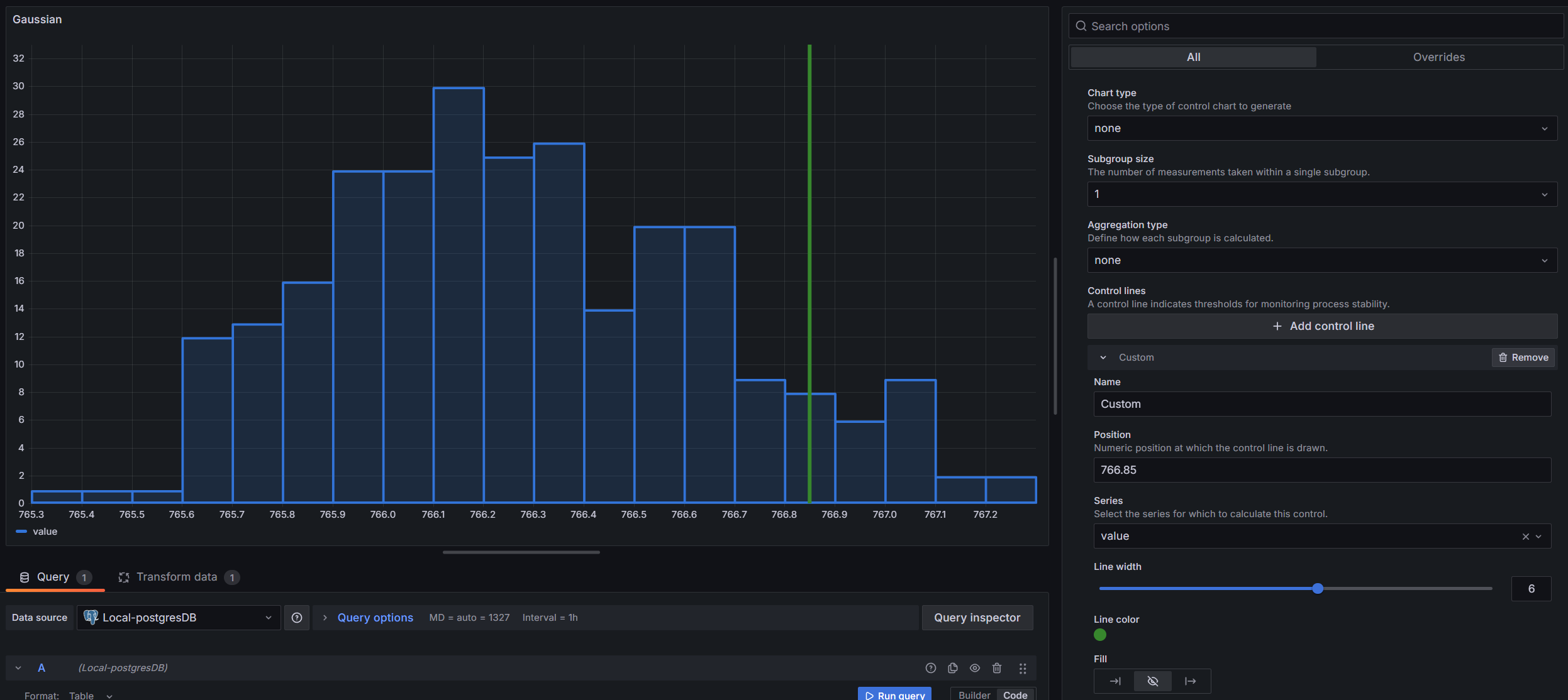
Control Lines
A control line is a vertical line on the histogram that marks a limit or threshold. You can use automatically calculated control lines or add your own custom values.
Calculated
These control lines are computed from the dataset. Select them in Editor > SPC > Control Lines > Add Control Line:
| Control Line | Description |
|---|---|
| LCL | Lower Control Limit — the lower boundary of the control chart |
| UCL | Upper Control Limit — the upper boundary of the control chart |
| Mean | Average of all sample values |
| Min | Smallest value in the dataset |
| Max | Largest value in the dataset |
| Range | Difference between the largest and smallest values |
| LSL | Lower Specification Limit — used for capability index calculations |
| USL | Upper Specification Limit — used for capability index calculations |
| Gaussian Peak (µ) | Peak of the fitted Gaussian curve — the mean (µ) from the Levenberg-Marquardt fit. Requires a Gaussian curve on the same series. May differ from the arithmetic Mean for non-normal data. |
Custom
There are two types of custom control lines:
Static value — You manually enter a fixed number for the line position. Use this when you have a known specification limit or target value.
Feature series — The line's value is pulled dynamically from a separate query in your data source. This is useful when your limits come from a database or calculation rather than being fixed numbers.
How to set up a feature series control line:
-
Set up your queries — Create at least two queries: one for the histogram data and another for the reference values (such as specification limits).
-
Mark the reference query as a feature query — Go to Editor > Histogram > Feature Queries and select the query that contains your reference data. This prevents it from being included in the histogram calculations.
-
Add a control line — Click Add Control Line and select Custom. In the Series dropdown, choose the query with your reference data.
-
Select the field — Under Position Input, select Series. A Field dropdown will appear showing all numeric fields from that query. Pick the field that contains your limit value.
-
The selected value will appear as a vertical line on the histogram.
If the selected field returns more than one value, the histogram uses the last value for the control line position.
Visualization
You can customize the appearance of each control line:
| Option | Description |
|---|---|
| Name | Display name shown on the histogram |
| Series | Which data series the line applies to (when you have multiple series) |
| Line width | Line thickness (1–10) |
| Color | Line color |
| Fill | Left fill, no fill, or right fill — shades the area on one side of the line |
| Fill Opacity | Transparency of the fill area (0–100%) |
Aggregation
When the chart type is set to none, you can choose an Aggregation Type in the editor. This transforms your raw data before building the histogram.
The available aggregation types depend on the Subgroup Size:
Subgroup size = 1:
- None — use raw values as-is
- Moving range — use the difference between consecutive values
Subgroup size > 1:
- Mean — average of each subgroup
- Range — difference between the largest and smallest values in each subgroup
- Standard Deviation — standard deviation within each subgroup
For example, with a subgroup size of 5 and Mean aggregation, the data is split into groups of 5 consecutive points, the average of each group is calculated, and the histogram is built from those averages.
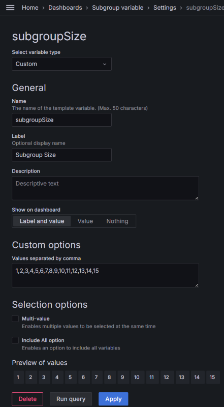
Dashboard Variable
You can control the subgroup size across multiple SPC Histogram panels using a single Grafana dashboard variable. Create a dashboard variable named subgroupSize, and all SPC Histogram panels on that dashboard will use its value automatically.
🔔 Bell Curves
The SPC Histogram can overlay a bell curve on the histogram. This helps you see how closely your data follows a normal distribution and quickly spot any skewness or unusual patterns.
You can add bell curves in Editor > Curve > Add a Bell Curve.
Gaussian Curve

The Gaussian curve fits an ideal normal distribution to your data. It shows what your data would look like if it were perfectly normally distributed, making it easy to compare against the actual histogram bars.
The curve is fitted using the Levenberg-Marquardt algorithm, which adjusts three parameters — height, center, and spread — until the curve matches your histogram as closely as possible. The implementation uses the ml-levenberg-marquardt library.
Histogram Curve
The histogram curve is a simpler visualization that connects the midpoints of each histogram bar with a smooth line. Unlike the Gaussian curve, it doesn't try to fit a mathematical model — it just shows the actual shape of your data distribution in a cleaner way.
This is useful when your data doesn't follow a normal distribution and you want to see its true shape without the noise of individual bars.
Curve Visualization
You can customize the appearance of each bell curve:
| Option | Description |
|---|---|
| Fit | Choose between Gaussian or Histogram curve fitting |
| Series | Which data series to calculate the curve for (when you have multiple series) |
| Line width | Line thickness (0–10) |
| Color | Curve line color |
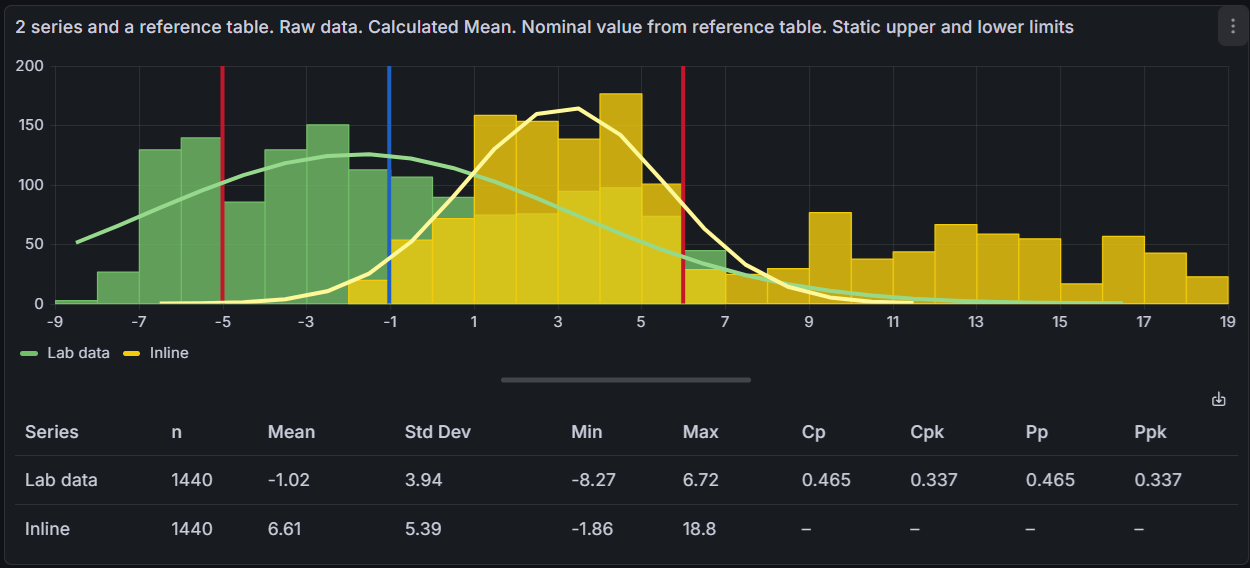
📋 Statistics Table
The SPC Histogram can display a statistics table below the histogram that summarizes key metrics for each data series. This table gives you a quick overview of your process data without needing to calculate anything manually.
Descriptive Statistics
The table shows the following columns for each series:
| Column | Description |
|---|---|
| Series | The name of the data series |
| n | Number of data points in the series |
| Mean | The average value of all data points |
| Std Dev | Standard deviation — how spread out the values are |
| Min | The smallest value in the series |
| Max | The largest value in the series |
Control Limits
When a control chart type is selected (XmR, Xbar-R, or Xbar-S), the table also shows:
| Column | Description |
|---|---|
| LCL | Lower Control Limit — the lower boundary calculated by the control chart |
| UCL | Upper Control Limit — the upper boundary calculated by the control chart |
These columns only appear when you have a chart type selected (not "none").
Process Capability Indices
Process capability indices tell you how well your process fits within specification limits. They answer the question: "Is my process producing results within the acceptable range?"
These columns only appear when you have defined both a Lower Specification Limit (LSL) and an Upper Specification Limit (USL) as control lines.
| Column | Description |
|---|---|
| Cp | Process capability — can the process fit within spec limits? |
| Cpk | Process capability adjusted for centering — is the process centered? |
| Pp | Process performance — similar to Cp but uses overall variation |
| Ppk | Process performance adjusted for centering — similar to Cpk using overall variation |
What are Cp and Cpk?
Cp measures whether the spread of your process is narrow enough to fit within the specification limits. It uses short-term variation (sigma-hat) estimated from within-subgroup data.
- Cp = 1.0 means the process spread exactly matches the spec width
- Cp > 1.33 is generally considered good — your process fits well within specs
- Cp < 1.0 means the process spread is wider than the spec limits
Cpk is like Cp, but also checks whether the process is centered between the spec limits. A high Cp with a low Cpk means your process is capable but shifted to one side.
What are Pp and Ppk?
Pp and Ppk are similar to Cp and Cpk, but they use the overall standard deviation instead of the within-subgroup estimate. This makes them better for evaluating long-term process performance.
- Use Cp/Cpk to understand short-term process capability
- Use Pp/Ppk to understand long-term process performance
- When Cp and Pp are similar, the process is stable over time
Setting up Specification Limits
To see capability indices in the table, you need to add LSL and USL control lines:
- Go to Editor > SPC > Control Lines
- Click Add Control Line and select LSL (Lower Specification Limit)
- Enter the lower specification value for your process
- Add another control line and select USL (Upper Specification Limit)
- Enter the upper specification value for your process
Once both limits are defined, the Cp, Cpk, Pp, and Ppk columns will appear in the table.
Editor Options
The statistics table can be configured in the panel editor under the Statistics Table section:
| Option | Description | Default |
|---|---|---|
| Show statistics table | Toggle the entire table on or off | Off |
| Visible columns | Choose which columns appear in the table. Use this to simplify the table by hiding columns you don't need. | All columns |
📥 Export to CSV
You can export all calculated SPC data to a CSV file. There are two ways to trigger the export:
- Download icon — Click the download icon in the top-right corner of the statistics table.
- Right-click menu — Right-click anywhere on the panel and select Download CSV.
The exported CSV file contains three sections:
| Section | Contents |
|---|---|
| Statistics | One row per series with the same columns shown in the table (Series, n, Mean, Std Dev, Min, Max, LCL, UCL, Cp, Cpk, Pp, Ppk). Only columns visible in the table are included. |
| Control Lines | Name, series, type, and resolved position for each configured control line. |
| Histogram | Bucket boundaries (min, max) and frequency counts for each series. |
The exported file is named spc-statistics_YYYY-MM-DD_HHMMSS.csv.
This exports the calculated values from the SPC analysis, not the raw data from the data source. Grafana's built-in "Download CSV" in the Inspect panel exports the raw data source values.
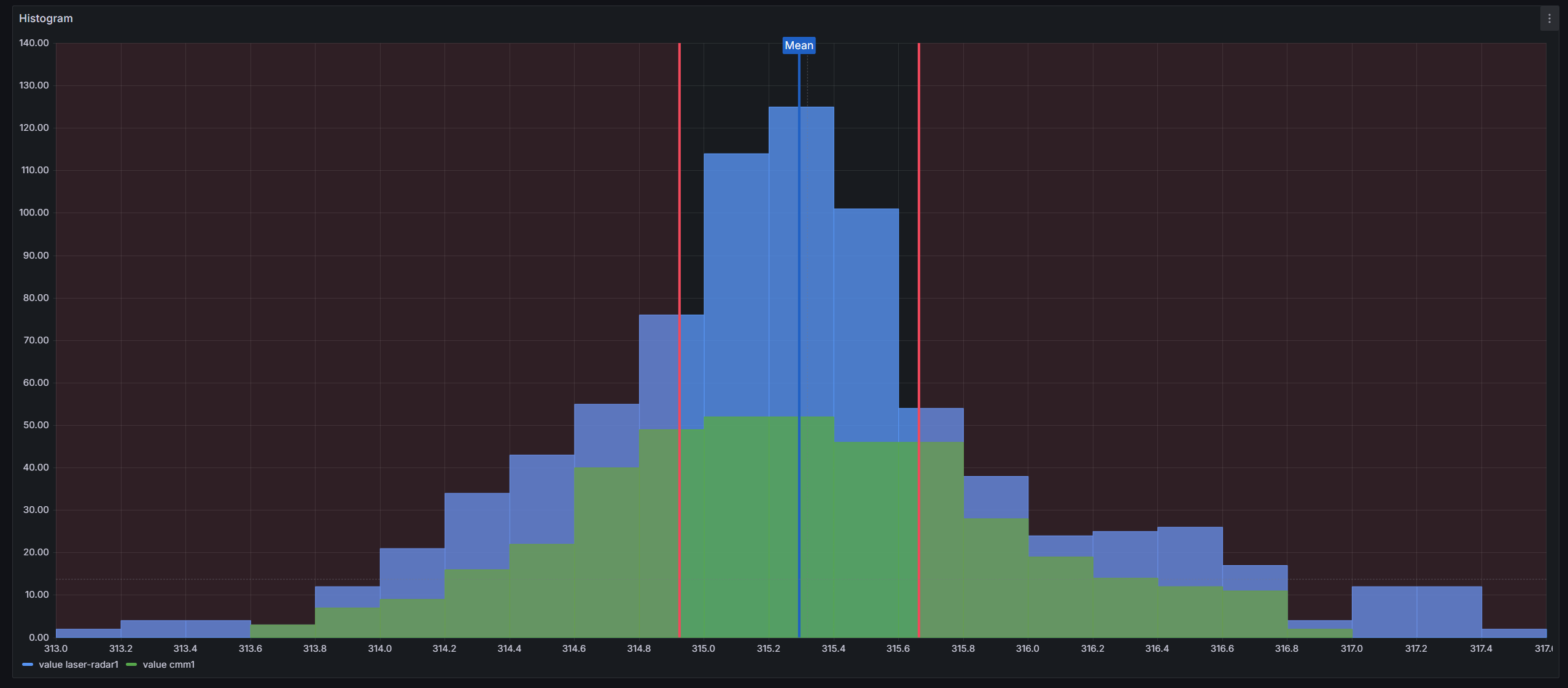
💬 Interactive Tooltips
The SPC Histogram displays an interactive tooltip when you hover over the chart. The tooltip provides contextual information depending on what element is under the cursor.
Bucket Tooltip — When you hover over a histogram bin:
| Field | Description |
|---|---|
| Bucket range | The lower and upper boundary of the bin (e.g., "Bucket 10 -- 12") |
| Series count | The number of data points in that bin for each series, with the series color indicator |
Control Line Tooltip — When you hover near a control line (within 30 pixels):
| Field | Description |
|---|---|
| Name | The control line's display name (e.g., "Mean", "UCL", "LSL") |
| Value | The numeric position of the control line on the x-axis |
| Color | A color indicator matching the control line's color |
Bell Curve Values — When a Gaussian bell curve is configured and you hover over a histogram bin, the tooltip includes an additional row showing the fitted Gaussian curve's value at that bin's center. This lets you compare the actual bin count against the expected value from the normal distribution fit.
Combined Tooltip — When a control line overlaps with a histogram bin, the tooltip shows all available information: the control line details at the top, followed by the bucket range, series counts, and bell curve values below.
⚙️ Configuration Reference
This section provides a quick reference for all panel options and field configuration settings.
Panel Options
Histogram
| Option | Description | Default |
|---|---|---|
| Bucket count | Approximate number of histogram bars | 30 |
| Bucket size | Fixed width for each bucket (overrides bucket count) | Auto |
| Bucket offset | Shifts bucket boundaries by a fixed amount | 0 |
| Combine series | Merge all series into a single histogram | Off |
| Feature Queries | Select queries excluded from histogram calculations | None |
SPC
| Option | Description | Default |
|---|---|---|
| Chart type | Control chart type: none, X chart (XmR), mR chart (XmR), X chart (Xbar-R), R chart (Xbar-R), X chart (Xbar-S), S chart (Xbar-S) | none |
| Subgroup size | Number of measurements per subgroup | 1 |
| Aggregation type | Data transformation before histogram: None, Moving range, Mean, Range, Standard Deviation. Only available when chart type is "none". | None |
| Control lines | Add and configure control lines (LCL, UCL, Mean, Min, Max, Range, LSL, USL, Gaussian Peak, Custom, Nominal) | None |
Curve
| Option | Description | Default |
|---|---|---|
| Add a Bell Curve | Add Gaussian or Histogram curve overlays with configurable series, line width, and color | None |
Statistics Table
| Option | Description | Default |
|---|---|---|
| Show statistics table | Toggle the statistics table below the histogram | Off |
| Visible columns | Choose which columns to display: n, Mean, Std Dev, Min, Max, LCL, UCL, Cp, Cpk, Pp, Ppk | All |
Legend
Standard Grafana legend options are available:
- Visibility — show or hide the legend
- Placement — bottom or right
- Width — fixed width when placed on the right
Field Configuration
| Option | Description | Default |
|---|---|---|
| Line width | Border thickness of histogram bars (0–10) | 1 |
| Fill opacity | Transparency of the bar fill (0–100) | 80 |
| Gradient mode | Gradient effect on bar fill: None, Opacity, Hue | None |
| Color | Series color using Grafana's standard color scheme | Classic palette |
Part of the KensoBI SPC Suite
SPC Histogram is part of a growing family of Statistical Process Control plugins for Grafana by Kenso Software:
SPC Characteristic Datasource — The datasource that powers the SPC CAD panel. Connects to your measurement database (PostgreSQL or MSSQL), lets you select features and characteristics through a point-and-click interface, and returns SPC statistics, time series measurements, and forecast data — no SQL required.
SPC CAD Panel — Brings 3D geometry into the picture, letting you bind the data from control charts and histograms to physical features on your parts.
SPC Chart Panel — Control charts for monitoring process stability over time. Supports Xbar-R, Xbar-S, and XmR charts with automatic calculation of control limits. If you're tracking whether a process is staying in control, this is your starting point.
SPC Box Plot Panel — Box-and-whisker plots with built-in SPC. Automatically groups measurements into subgroups, computes quartiles and outliers, and overlays Xf-Rf control limits to detect shifts in both process location and spread.
SPC Bullet Panel — Compact bullet charts and progress bars with optional SPC metrics (Cpk, Cp, Ppk, Pp, Sigma Level) for dense KPI dashboards.
SPC Pareto Panel — Pareto charts for identifying the most significant factors contributing to defects or issues. Automatic sorting, cumulative percentage lines, and 80/20 threshold analysis help you focus improvement efforts where they matter most.
Support
If you have any questions or feedback, you can:
- Ask a question on the KensoBI Discord channel.
- GitHub Issues: https://github.com/KensoBI/spc-histogram/issues
License
This software is distributed under the AGPL-3.0-only license — see LICENSE for details.