SPC Pareto
The SPC Pareto panel helps you identify the most significant factors contributing to defects, downtime, or any categorical issue — so you can focus improvement efforts where they matter most.
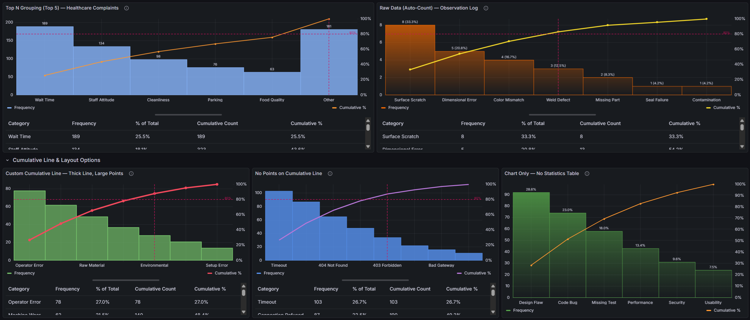
Table of Contents
- Why SPC Pareto?
- Built for Grafana
- Features
- Use Cases
- Requirements
- Getting Started
- Overview & Concepts
- Data Format Guide
- Configuration Reference
- Part of the KensoBI SPC Suite
- License
- Support
Why SPC Pareto?
The Pareto principle (80/20 rule) states that roughly 80% of effects come from 20% of causes. This plugin makes that insight instantly visible:
- Bars sorted by impact — categories are automatically ranked from highest to lowest frequency, making the biggest contributors immediately obvious
- Cumulative percentage line — a running total overlay shows how quickly contributions accumulate toward 100%
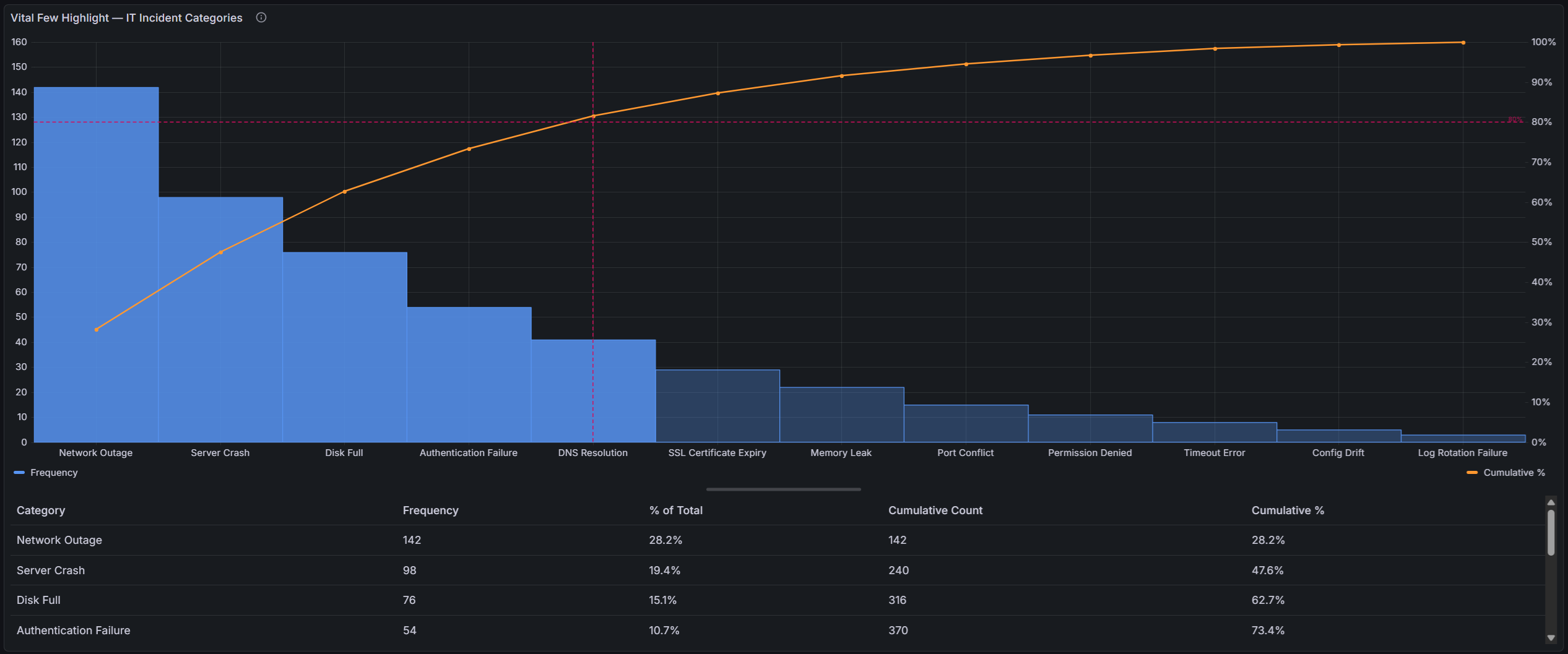
- 80/20 threshold line — a configurable threshold line highlights where the "vital few" end and the "trivial many" begin
Built for Grafana
SPC Pareto is built using Grafana's native visualization components. This means it inherits the look, feel, and behavior you already know:
- Native theming — automatically adapts to light and dark mode
- Standard panel options — legend placement, tooltip behavior, and field overrides work just like any other Grafana panel
- Resizable statistics table — drag the splitter to balance chart and table space, just like Grafana's built-in panels
- Works with any data source — use it with SQL databases, Prometheus, InfluxDB, CSV files, or any other Grafana data source
Features
| Feature | Description |
|---|---|
| Raw data support | Accepts ungrouped observations and counts occurrences automatically |
| Automatic sorting | Categories are ranked by frequency — no manual ordering needed |
| Dual y-axes | Left axis shows frequency counts, right axis shows cumulative percentage (0–100%) |
| Threshold line | Configurable threshold (default 80%) with horizontal and vertical reference lines |
| Vital few highlight | Bars beyond the threshold crossing point are visually muted, making the vital few stand out |
| Cumulative line | Customizable color, width, and point markers |
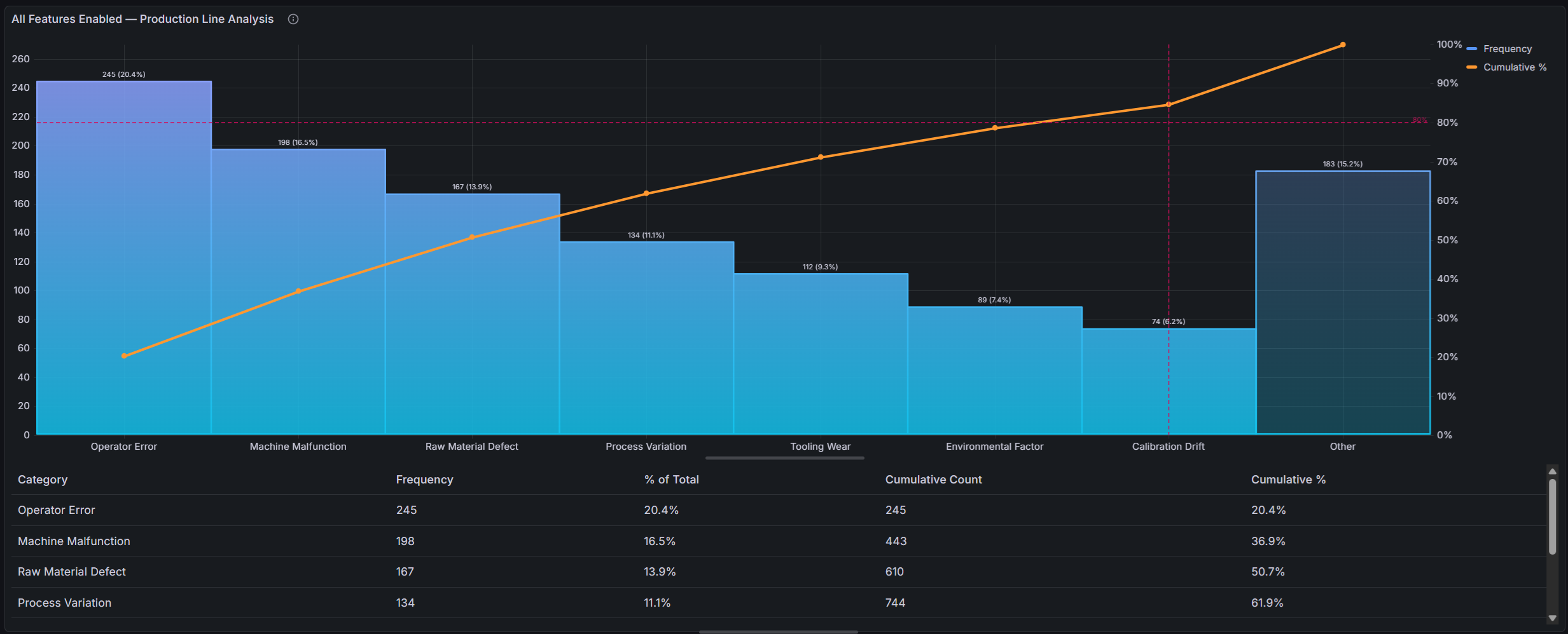
| Top N / Other grouping | Collapse low-frequency categories into an "Other" bucket to reduce noise |
| Value labels | Optional count, percentage, or both displayed above each bar |
| Statistics table | Interactive table with category, frequency, % of total, cumulative count, and cumulative % |
| Resizable layout | Drag the splitter between chart and table to adjust the view |
Use Cases
| Domain | Example |
|---|---|
| Manufacturing quality | Identify top defect types across production lines |
| IT operations | Rank incident categories to prioritize root cause analysis |
| Customer support | Surface the most common complaint categories |
| Software development | Analyze bug categories, test failure reasons, or build errors |
| Supply chain | Rank supplier issues or shipment delay causes |
| Healthcare | Patient complaint categories, medication errors |
Requirements
- Grafana 11 or later
Getting Started
- Install the plugin from the Grafana Plugin Catalog
- Add a new panel and select SPC Pareto as the visualization
- Configure a query that returns either:
- A string field + a number field (pre-aggregated categories and counts), or
- A string field only (raw observations — the plugin counts occurrences automatically)
- The chart automatically sorts, calculates cumulative percentages, and renders the Pareto view
Example Query (SQL — pre-aggregated)
SELECT defect_type AS category, COUNT(*) AS count
FROM inspections
WHERE $__timeFilter(inspection_time)
GROUP BY defect_type
📊 Overview & Concepts
What is a Pareto Chart?
A Pareto chart is a combined bar-and-line chart used in quality control and process improvement. It is named after Vilfredo Pareto and his observation that roughly 80% of effects come from 20% of causes — known as the Pareto principle or the 80/20 rule.
The chart consists of:
- Bars — representing individual categories (e.g., defect types), sorted in descending order by frequency or impact
- Cumulative percentage line — a running total that shows how categories accumulate toward 100%
- Threshold line — typically set at 80%, marking the boundary between the "vital few" and the "trivial many"
By reading the chart left to right, you can quickly identify which categories contribute the most to the total and where cumulative effort should be focused.
How the SPC Pareto Panel Works
The plugin takes query results containing categories (string values) and optionally counts (numeric values), then automatically:
- Counts occurrences automatically if raw (ungrouped) observations are provided, or uses pre-aggregated counts
- Sorts categories from highest to lowest count
- Optionally groups low-frequency categories into an "Other" bucket (Top N grouping)
- Calculates each category's percentage of the total
- Computes the running cumulative percentage
- Renders bars on the left y-axis (frequency) and the cumulative line on the right y-axis (0–100%)
- Draws a configurable threshold line (default 80%) across both axes
- Optionally highlights the "vital few" by muting bars beyond the threshold crossing point
- Optionally displays value labels (count, percentage, or both) above each bar
Anatomy of the Panel
The panel is divided into two resizable sections:
- Chart area (top) — the Pareto chart with bars, cumulative line, and threshold
- Statistics table (bottom) — an interactive table showing detailed numbers for each category
Drag the splitter between them to adjust the layout.
When to Use a Pareto Chart
Pareto charts are most useful when you need to:
- Prioritize improvement efforts — determine which defect types, failure modes, or issue categories to address first
- Communicate impact — show stakeholders where the biggest opportunities lie
- Track progress — compare Pareto charts before and after corrective actions to verify improvement
- Validate assumptions — confirm whether the 80/20 pattern holds in your data
🔌 Data Format Guide
The SPC Pareto panel supports two data formats, detected automatically:
Pre-aggregated Data (category + count)
The most common format. Your query returns two fields:
- A string field — category names (e.g., defect type, error code, department name)
- A number field — the count or frequency for each category
The plugin uses the first string field and the first number field found in the query results. Field names do not matter — only the field types are used for matching.
If your query returns multiple frames (e.g., from multiple queries), the plugin combines all frames by collecting category-value pairs from each. Duplicate categories across frames are automatically merged by summing their values.
Raw Observations (ungrouped data)
If your query returns only a string field with no accompanying number field, the plugin switches to raw mode and counts occurrences of each unique value automatically. This is useful when your data source provides individual records rather than pre-aggregated counts.
For example, a table of individual inspection results:
| defect_type |
|---|
| Scratch |
| Dent |
| Scratch |
| Scratch |
| Contamination |
| Dent |
The plugin counts: Scratch = 3, Dent = 2, Contamination = 1 — and renders the Pareto chart from those counts.
Tip: Raw mode is triggered when no frame in the query results contains both a string and a number field. If any frame has both, the plugin uses the aggregated path for all frames.
Query Examples
SQL Databases (MySQL, PostgreSQL, MSSQL)
Pre-aggregated (GROUP BY in the query):
SELECT defect_type AS category, COUNT(*) AS count
FROM inspections
WHERE $__timeFilter(created_at)
GROUP BY defect_type
Raw observations (let the plugin count):
SELECT defect_type
FROM inspections
WHERE $__timeFilter(created_at)
With a time range filter and additional grouping:
SELECT
  failure_mode,
  COUNT(*) AS occurrences
FROM production_events
WHERE $__timeFilter(event_time)
  AND line_id = '$line'
GROUP BY failure_mode
ORDER BY occurrences DESC
Note: The plugin sorts categories automatically. You do not need
ORDER BYin your query, but it won't cause issues if included.
InfluxDB (Flux)
from(bucket: "manufacturing")
  |> range(start: v.timeRangeStart, stop: v.timeRangeStop)
  |> filter(fn: (r) => r._measurement == "defects")
  |> group(columns: ["defect_type"])
  |> count()
  |> rename(columns: {defect_type: "category", _value: "count"})
Prometheus
Prometheus data is typically numeric time series. To use it with Pareto, you need categorical labels and counts. One approach:
sum by (error_type) (increase(app_errors_total[$__range]))
The error_type label becomes the category, and the summed increase becomes the count.
TestData (for demos)
Use the built-in TestData data source with the CSV Content scenario:
Pre-aggregated:
category,count
Scratch,45
Dent,38
Contamination,29
Misalignment,22
Color Defect,15
Crack,12
Burr,8
Warping,6
Porosity,4
Raw observations (the plugin counts automatically):
defect_type
Scratch
Dent
Scratch
Contamination
Scratch
Dent
Misalignment
Scratch
Color Defect
Dent
JSON API
If your API returns JSON, use the JSON data source or Infinity data source:
[
  { "category": "Scratch", "count": 45 },
  { "category": "Dent", "count": 38 },
  { "category": "Contamination", "count": 29 }
]
Multiple Queries
If you configure multiple queries (A, B, C...), the plugin extracts category-value pairs from each frame and combines them into a single Pareto chart. This is useful when data comes from different sources or tables.
Data Transformations
You can use Grafana's built-in Transformations to reshape your data before it reaches the panel. Useful transformations include:
- Filter by name — select specific fields
- Rename by regex — adjust field names
- Reduce — collapse multiple rows into summary statistics
Troubleshooting
"No data" or error view
The panel shows an error view when:
- No query results are returned
- The results contain no string field (needed for categories)
Fix: Ensure your query returns at least one string column. A numeric column is optional — if omitted, the plugin counts occurrences of each unique string value.
Categories appear unsorted
The plugin always sorts categories by descending value. If your chart appears unsorted, check whether:
- The number field contains the expected values (not nulls or strings)
- Multiple frames are being combined in an unexpected way
All bars are the same height
This usually means the number field contains identical values. Check your GROUP BY clause and aggregation function.
⚙️ Configuration Reference
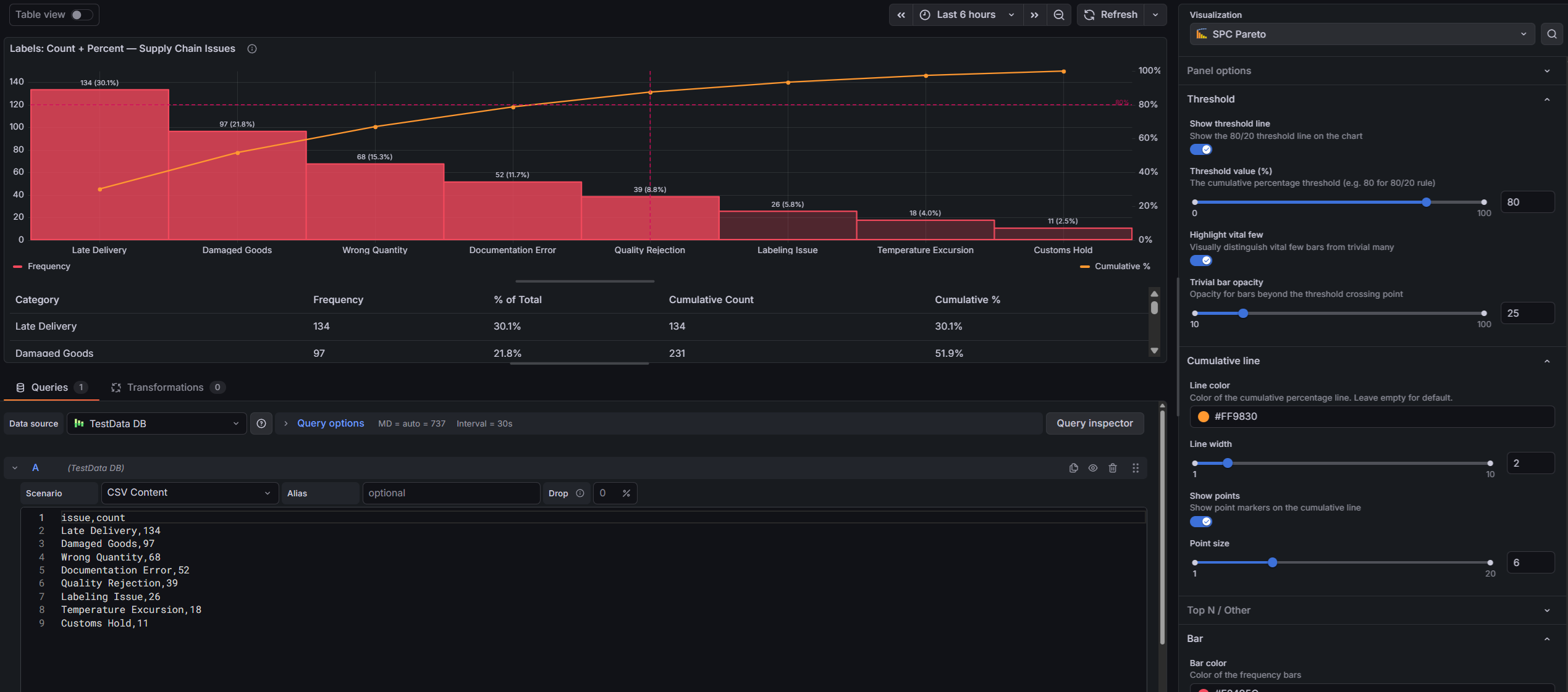
This section covers all panel options and field configuration settings available in the SPC Pareto panel.
Threshold
| Option | Description | Default |
|---|---|---|
| Show threshold line | Toggle the 80/20 threshold lines on the chart. When enabled, a horizontal dashed line is drawn at the threshold percentage, and a vertical dashed line marks the category where the cumulative percentage crosses the threshold. | On |
| Threshold value | The cumulative percentage at which to draw the threshold line. The classic Pareto threshold is 80%, but you can adjust this to any value between 0 and 100. Only visible when "Show threshold line" is enabled. | 80% |
| Highlight vital few | Visually distinguish the "vital few" bars from the "trivial many". When enabled, bars beyond the threshold crossing point are drawn with reduced opacity, making the most impactful categories stand out. Requires "Show threshold line" to be enabled. | Off |
| Trivial bar opacity | Controls the opacity of bars beyond the threshold crossing point (the "trivial many"), from 10% to 100%. Lower values create a stronger visual contrast between vital and trivial categories. Only visible when "Highlight vital few" is enabled. | 40% |
Cumulative Line
| Option | Description | Default |
|---|---|---|
| Line color | The color of the cumulative percentage line. Leave empty to use the theme's default warning color (yellow/amber). Click to open the color picker. | Theme warning color |
| Line width | The stroke width of the cumulative percentage line, in pixels. | 2 |
| Show points | Whether to show circular point markers at each data point on the cumulative line. Useful for identifying exact category positions. | On |
| Point size | The size of point markers on the cumulative line, in pixels. Only visible when "Show points" is enabled. | 5 |
Top N / Other
| Option | Description | Default |
|---|---|---|
| Limit categories | When enabled, only the top N categories are shown individually. All remaining categories are grouped into a single "Other" bucket. This is useful when your data has many low-frequency categories that add clutter to the chart. | Off |
| Show top N categories | The number of individual categories to display before grouping the rest into "Other". Only visible when "Limit categories" is enabled. | 10 |
Bar
| Option | Description | Default |
|---|---|---|
| Bar color | The fill color of the frequency bars. Click to open the color picker. | Blue |
| Fill opacity | Controls the opacity of the bar fill, from 0 (transparent) to 100 (solid). | 80% |
| Line width | Controls the border width of the bars, in pixels. | 1 |
| Gradient mode | Controls the gradient fill of the bars. Options: None, Opacity, Hue. | None |
| Show value labels | Display labels above each bar showing the frequency value, percentage, or both. Useful for reading exact values without hovering or consulting the table. | Off |
| Label content | What to display in the bar labels. Options: Count (raw frequency), % of Total (percentage of grand total), Both (count and percentage). Only visible when "Show value labels" is enabled. | Count |
Statistics Table
| Option | Description | Default |
|---|---|---|
| Show statistics table | Toggle the interactive statistics table below the chart. When enabled, a resizable table displays detailed metrics for each category. | On |
Legend
Standard Grafana legend options are available:
- Visibility — show or hide the legend
- Placement — bottom or right
- Width — fixed width when placed on the right
Tooltip
Standard Grafana tooltip options are available:
- Mode — single or all series
Layout
The panel is divided into two resizable panes:
- Chart (top) — the Pareto chart visualization
- Statistics table (bottom) — the interactive data table
Drag the horizontal splitter between them to adjust how much space each section occupies. The default split is 75% chart / 25% table.
Axes
The chart uses three axes:
| Axis | Position | Description |
|---|---|---|
| Categories | Bottom | Category names from the string field. Labels are automatically thinned if there are too many to display without overlap. |
| Frequency | Left | Numeric values from the number field. Automatically scaled with a soft minimum of 0. |
| Cumulative % | Right | Fixed scale from 0% to 100%. Shows the running cumulative percentage. |
Tooltip Behavior
Hovering over the chart displays a tooltip with:
- Category name — the category under the cursor
- Frequency — the raw count/value for that category
- % of Total — the category's share of the overall total
- Cumulative % — the running cumulative percentage up to and including that category
Part of the KensoBI SPC Suite
SPC Pareto is part of a growing family of Statistical Process Control plugins for Grafana by Kenso Software:
SPC Characteristic Datasource — The datasource that powers the SPC CAD panel. Connects to your measurement database (PostgreSQL or MSSQL), lets you select features and characteristics through a point-and-click interface, and returns SPC statistics, time series measurements, and forecast data — no SQL required.
SPC CAD Panel — Brings 3D geometry into the picture, letting you bind the data from control charts and histograms to physical features on your parts.
SPC Chart Panel — Control charts for monitoring process stability over time. Supports Xbar-R, Xbar-S, and XmR charts with automatic calculation of control limits. If you're tracking whether a process is staying in control, this is your starting point.
SPC Histogram Panel — Distribution analysis with histograms, bell curves, and a built-in statistics table showing Cp, Cpk, Pp, and Ppk. Use it to understand process capability: is your process producing results within specification limits?
SPC Box Plot Panel — Box-and-whisker plots with built-in SPC. Automatically groups measurements into subgroups, computes quartiles and outliers, and overlays Xf-Rf control limits to detect shifts in both process location and spread.
SPC Bullet Panel — Compact bullet charts and progress bars with optional SPC metrics (Cpk, Cp, Ppk, Pp, Sigma Level) for dense KPI dashboards.
Support
If you have any questions or feedback, you can:
- Ask a question on the KensoBI Discord channel.
- GitHub Issues: https://github.com/kensobi/spc-pareto/issues
License
This software is distributed under the AGPL-3.0-only license — see LICENSE for details.